An Example about How to Avoid “Chartjunk” while Plotting Figures
Reference [1] provides 10 simple rules for improvement of figure plotting, i.e., (1) Know Your Audience, (2) Identify Your Message, (3) Adapt the Figure to the Support Medium, (4) Captions Are Not Optional, (5) Do Not Trust the Defaults, (6) Use Color Effectively, (7) Do Not Mislead the Reader, (8) Avoid Chartjunk, (9) Message Trumps Beauty, and (10) Get the Right Tool. Among which, the article provides an example in Avoid Chartjunk section, to show what is “Chartjunk” and how to improve it:
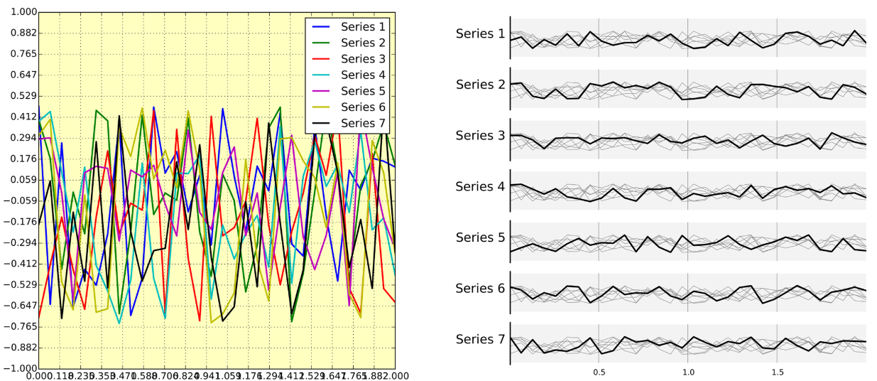
We have seven series of samples that are equally important, and we would like to show them all in order to visually compare them (exact signal values are supposed to be given elsewhere). The left figure demonstrates what is certainly one of the worst possible designs. All the curves cover each other and the different colors (that have been badly and automatically chosen by the software) do not help to distinguish them. The legend box overlaps part of the graphic, making it impossible to check if there is any interesting information in this area. There are far too many ticks: x labels overlap each other, making them unreadable, and the three-digit precision does not seem to carry any significant information. Finally, the grid does not help because (among other criticisms) it is not aligned with the signal, which can be considered discrete given the small number of sample points. The right figure adopts a radically different layout while using the same area on the sheet of paper. Series have been split into seven plots, each of them showing one series, while other series are drawn very lightly behind the main one. Series labels have been put on the left of each plot, avoiding the use of colors and a legend box. The number of x ticks has been reduced to three, and a thin line indicates these three values for all plots. Finally, y ticks have been completely removed and the height of the gray background boxes indicate the [−1,+1] range (this should also be indicated in the figure caption if it were to be used in an article).
All the figures of this article had been already produce by authors, by means of Python matplotlib package, and could be found in Github repository [3], of course this example (Fig. 7) included [4].
I think this is an interesting way to presenting data, so I reproduce it using MATLAB. The code and generated figure show as follows:
1
2
3
4
5
6
7
8
9
10
11
12
13
14
15
16
17
18
19
20
21
22
23
24
25
26
27
28
29
30
31
32
33
34
35
36
37
38
39
40
clc,clear,close all
rng("default")

numPoints = 50;
numLine = 7;
t = 1:numPoints;
x = randn(numLine,numPoints);

figure("Color","w","Position",[680,80,787,851])
tiledlayout(numLine,1,"TileSpacing","tight")

for ii = 1:numLine
    nexttile
    plot(t,x)
    ax = gca();
    set(ax,"Color",[243,243,243]/255, ...
        "Box","off","YGrid","off","XGrid","on","LineWidth",1.2, ...
        "FontName","Times New Roman","FontSize",12)
    set(ax.YLabel,"String",sprintf("Line %s",num2str(ii)));

    for jj = 1:numLine
        if jj ~= ii
        	% Not emphasising data line, N.B.: numLine+1-jj
            set(ax.Children(numLine+1-jj),"Color",[194,194,194]/255)
        else
        	% Emphasising data line, % N.B.: numLine+1-jj
            set(ax.Children(numLine+1-jj),"Color",[0,0,0],"LineWidth",1.5);
        end
    end
    % Topping the emphasised data line, % N.B.: numLine+1-ii
    uistack(ax.Children(numLine+1-ii),'top')

    if ii ~= numLine
    	% Hidde XTick if not the last axes
        set(ax,"xColor","none");
    else
        set(ax.XLabel,"String","No.");
    end
end
% exportgraphics(gcf,"pic.jpg","Resolution",600)
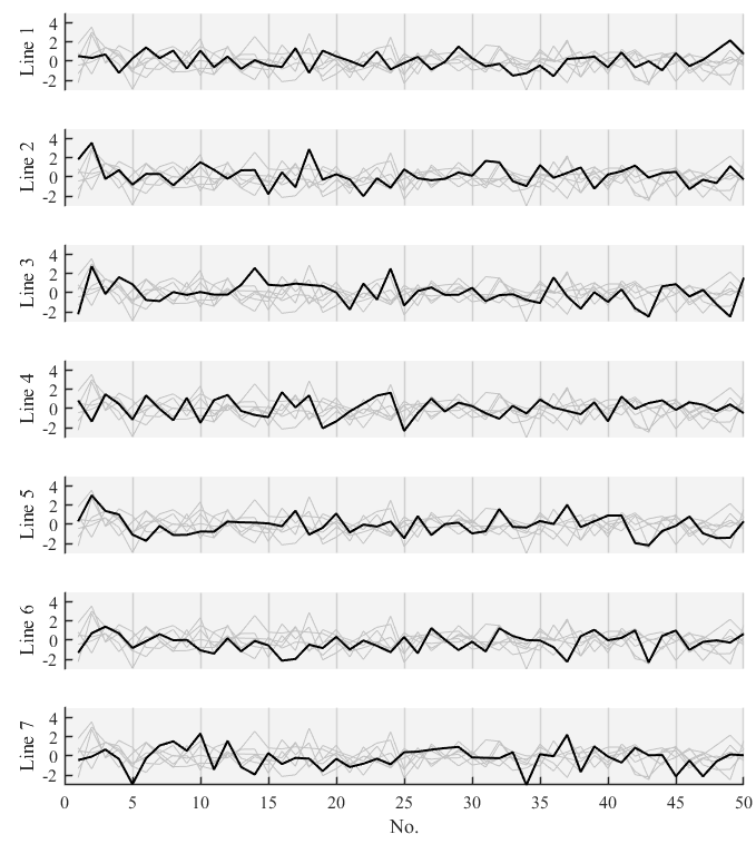
In general, it is easy to reproduce, and the main purpose of recording this example for me is taking notes about how to set those properties of Axes Class which are not commonly used, like "YGrid", "XGrid", "xColor". I mainly refer to blog [5] to specify these settings. By the way, blog [5] by Slandarer shows a detailed way to construct ternary plot using MATLAB, which really is beautiful and inspired.
References
[1] Ten Simple Rules for Better Figures - PLOS Computational Biology.
[2] Ten Simple Rules for Better Figures: Avoid Chartjunk - PLOS Computational Biology.
[3] rougier/ten-rules: Ten simple rules for better figures.