MATLAB swarmchart and swarmchart3 — Swarm scatter chart
MATLAB swarmchart function
MATLAB provides a function swarmchart1 to plot a swarm scatter chart.
swarmchart(x,y) displays a swarm chart, which is a scatter plot with the points offset (jittered) in the x-dimension. The points form distinct shapes, and the outline of each shape is similar to a violin plot. Swarm charts help you to visualize discrete x data with the distribution of the y data. At each location in x, the points are jittered based on the kernel density estimate of y.
- To plot one set of points, specify
xandyas vectors of equal length. - To plot multiple sets of points on the same set of axes, specify at least one of
xoryas a matrix.
I feel interested about this function, because, as mentioned in blog2, I really like a Python graphic example, “Palmer Penguins exploration with violinplots in Matplotlib”3, and when I saw this example for the first time, I instantly loved the way how it realizes jittered data points; so when I saw “jitter” in the swarmchart function documentation, I really wanted to have a look in detail. So, I test some official examples as follows1.
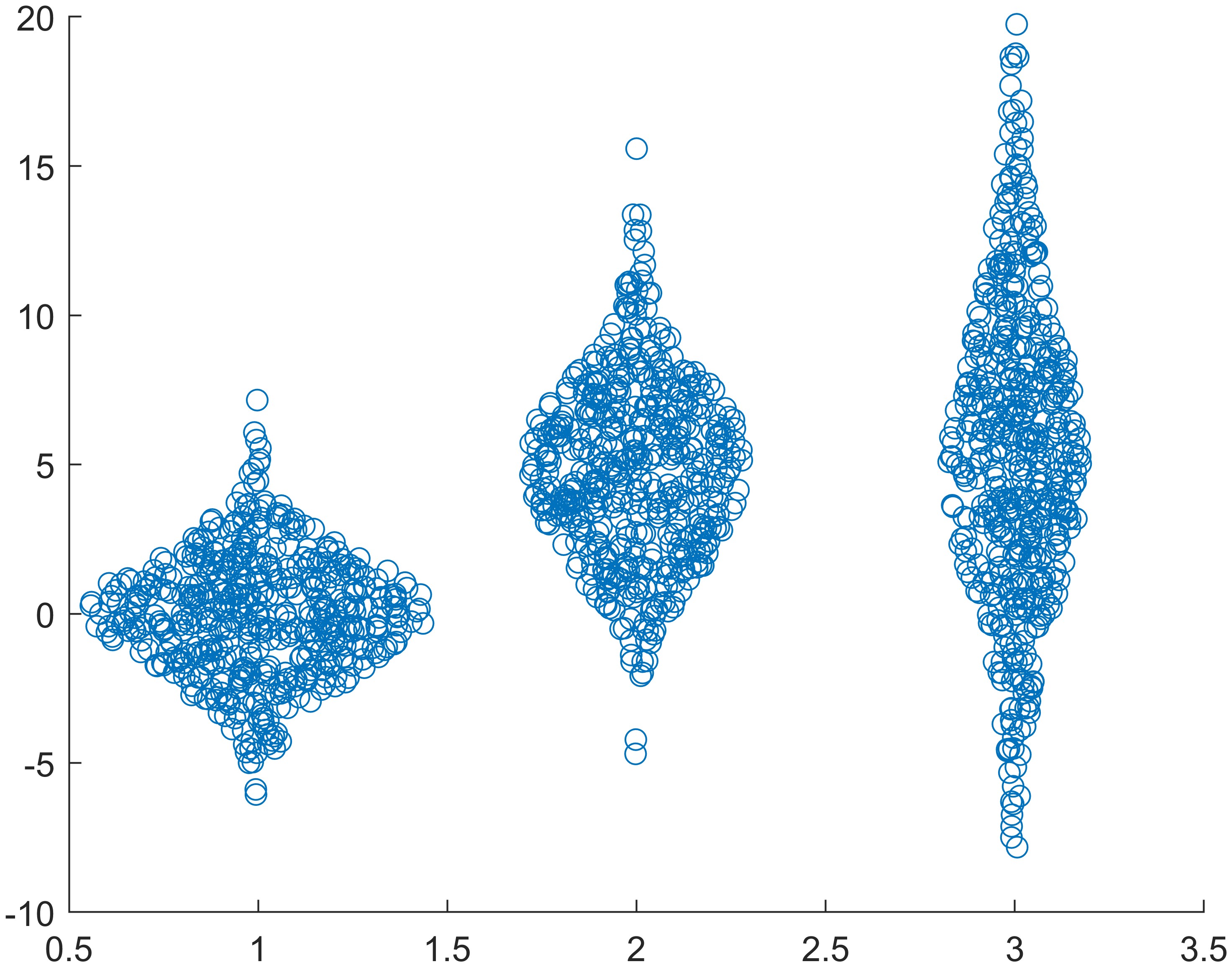
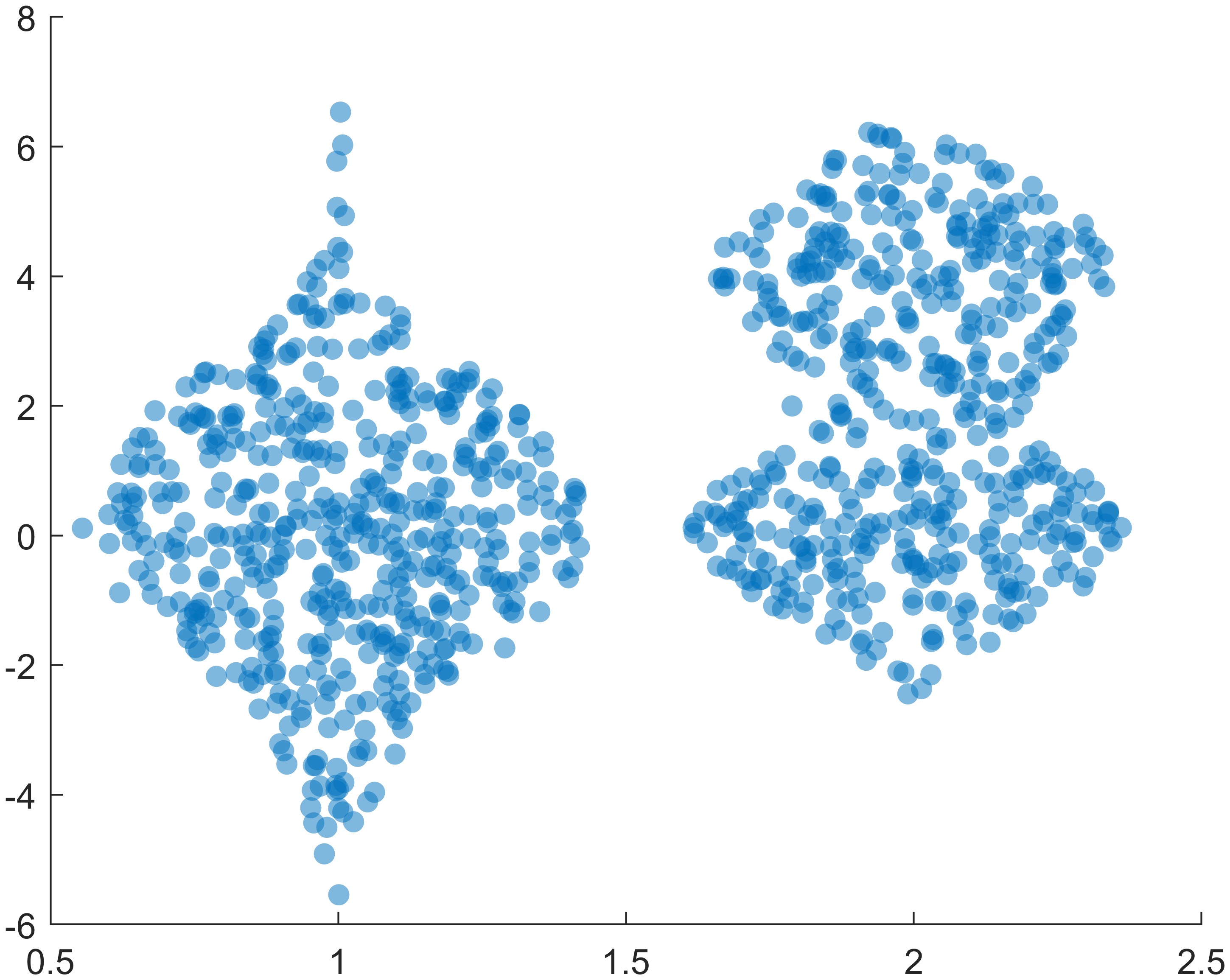
Example 1: Create swarm chart
1
2
3
4
5
6
7
8
9
10
clc, clear, close all

x = [ones(1,500) 2*ones(1,500) 3*ones(1,500)];
y1 = 2 * randn(1,500);
y2 = 3 * randn(1,500) + 5;
y3 = 5 * randn(1,500) + 5;
y = [y1 y2 y3];
swarmchart(x,y)

exportgraphics(gca, 'fig1.jpg', 'Resolution', 600)
Example 2: Plot Multiple data sets with custom marker size
1
2
3
4
5
6
7
8
9
10
11
12
13
14
15
16
clc, clear, close all

x1 = ones(1,500);
x2 = 2 * ones(1,500);
x3 = 3 * ones(1,500);
y1 = 2 * randn(1,500);
y2 = [randn(1,250) randn(1,250) + 4];
y3 = 5 * randn(1,500) + 5;

swarmchart(x1,y1,5)
hold on
swarmchart(x2,y2,5)
swarmchart(x3,y3,5)
hold off

exportgraphics(gca, 'fig2.jpg', 'Resolution', 600)
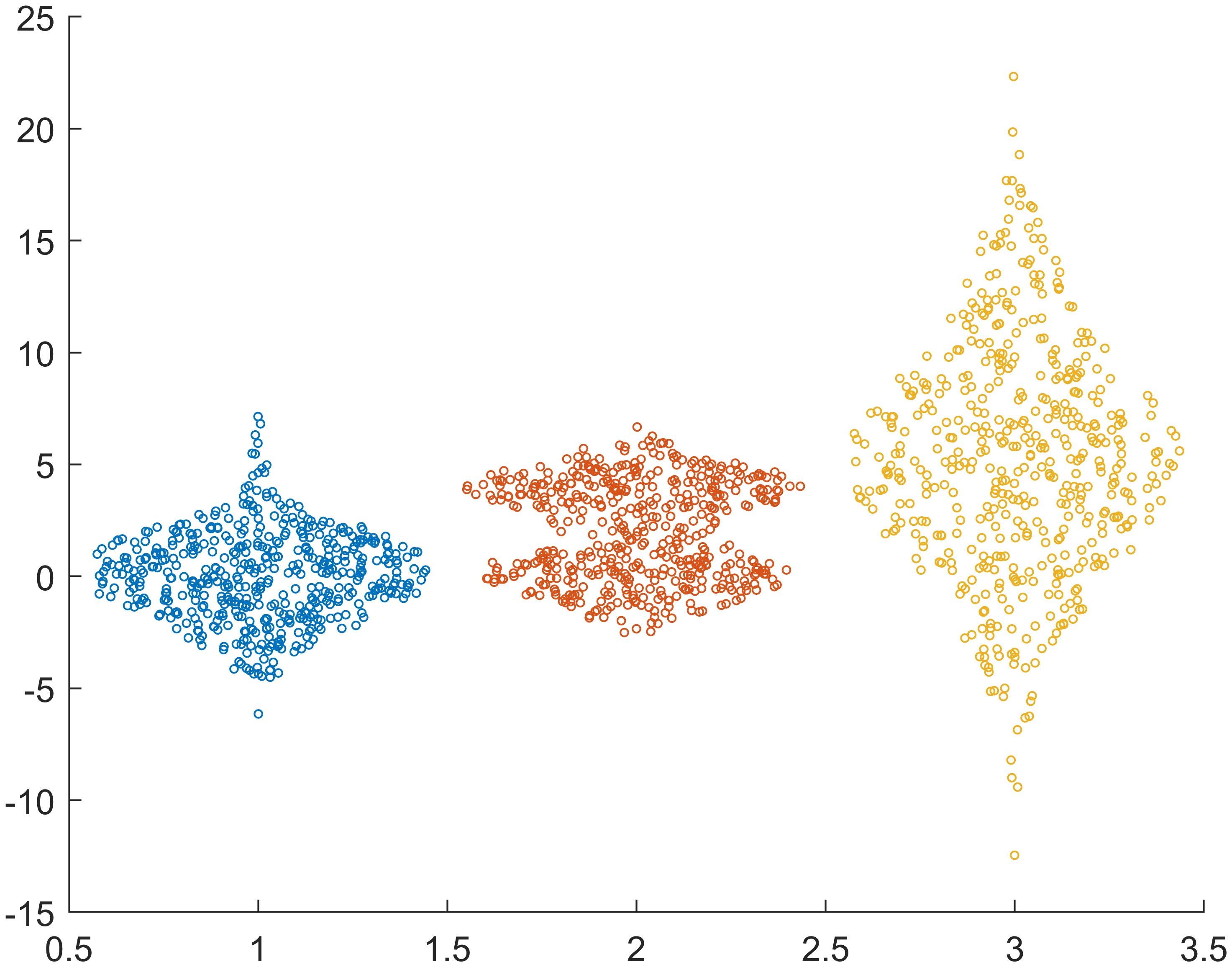
From this example, we can see that we could create multiple swarm charts in the axes one by one, so we can customize each chart more easily.
Example 3: Display filled markers with varied color & change jitter type and jitter width
1
2
3
4
5
6
7
8
9
10
11
12
13
clc, clear, close all

tbl = readtable("BicycleCounts.csv");
daynames = ["Sunday" "Monday" "Tuesday" "Wednesday" "Thursday" "Friday" "Saturday"];
x = categorical(tbl.Day,daynames);
y = tbl.Total;
c = hour(tbl.Timestamp); % Specify the colors of the markers as vector c
s = swarmchart(x,y,5,c);

s.XJitter = 'rand';
s.XJitterWidth = 0.5;

exportgraphics(gca, 'fig3.jpg', 'Resolution', 600)
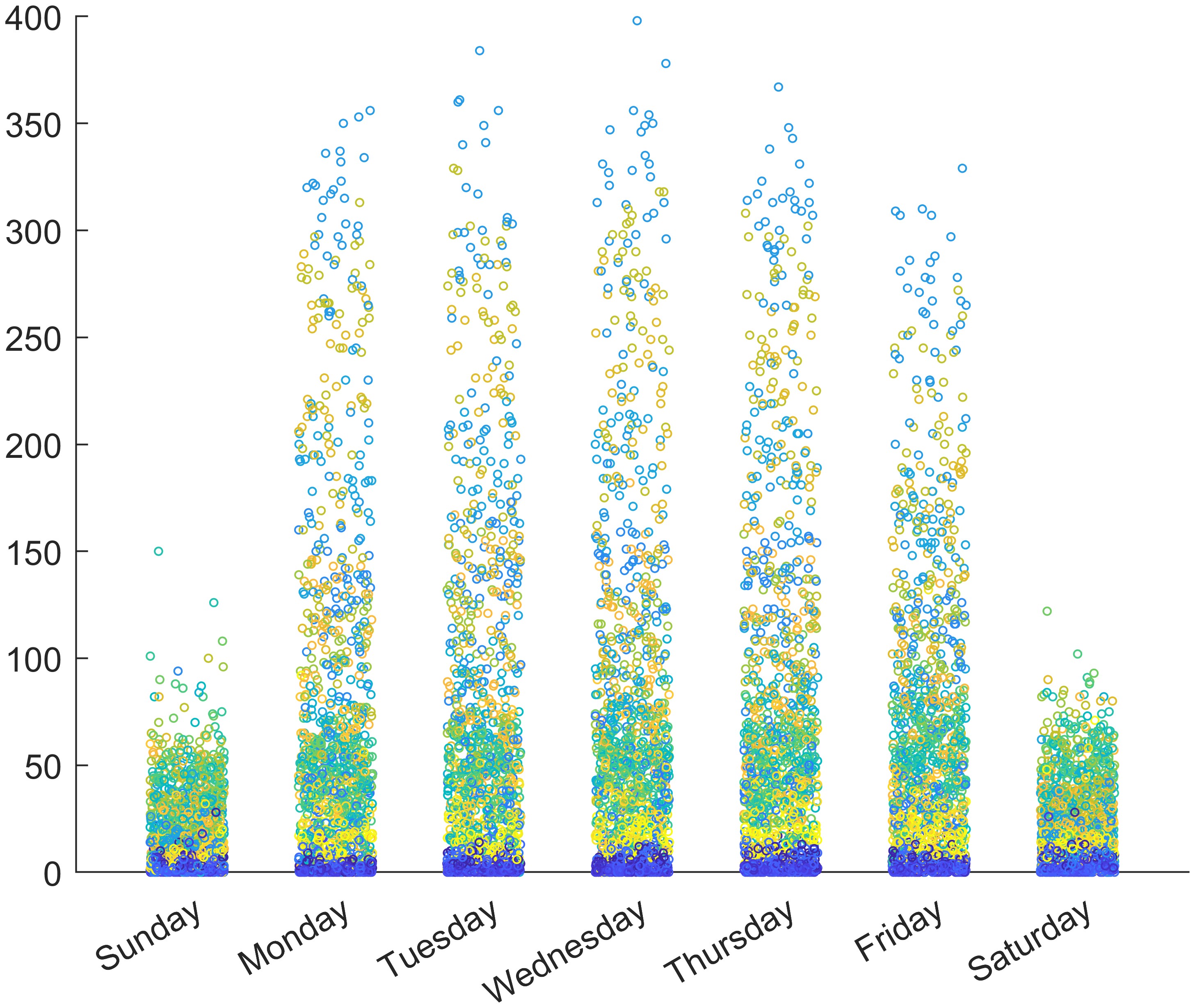
In this example, we can see how to specify markers color according to some certain values, c = hour(tbl.Timestamp); in this example. Also, it shows how to change the distribution of jitters.
There are three distributions supported1:
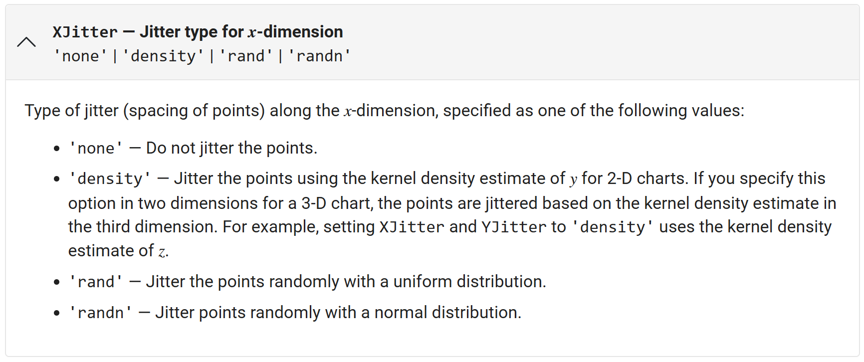
and corresponding algorithm to generate jitters:
The points in a swarm chart are jittered using uniform random values that are weighted by the Gaussian kernel density estimate of y and the relative number of points at each x location. This behavior corresponds to the default 'density' setting of the XJitter property on the Scatter object when you call the swarmchart function.
The maximum spread of points at each x location is 90% of the smallest distance between adjacent x values by default:
1
spread = 0.9 * min(diff(unique(x)));
You can control the spread by setting the XJitterWidth property of the Scatter object.
Horizontal swarm charts are jittered using the same algorithm, but the points are jittered along the y dimension using the Gaussian kernel density estimate of x. In this case, you control the spread using the YJitterWidth property.
Example 4: Specify filled markers with transparency
1
2
3
4
5
6
7
8
9
10
11
clc, clear, close all

x1 = ones(1,500);
x2 = 2 * ones(1,500);
x = [x1 x2];
y1 = 2 * randn(1,500);
y2 = [randn(1,250) randn(1,250) + 4];
y = [y1 y2];
swarmchart(x,y,'filled','MarkerFaceAlpha',0.5,'MarkerEdgeAlpha',0.5)

exportgraphics(gca, 'fig4.jpg', 'Resolution', 600)
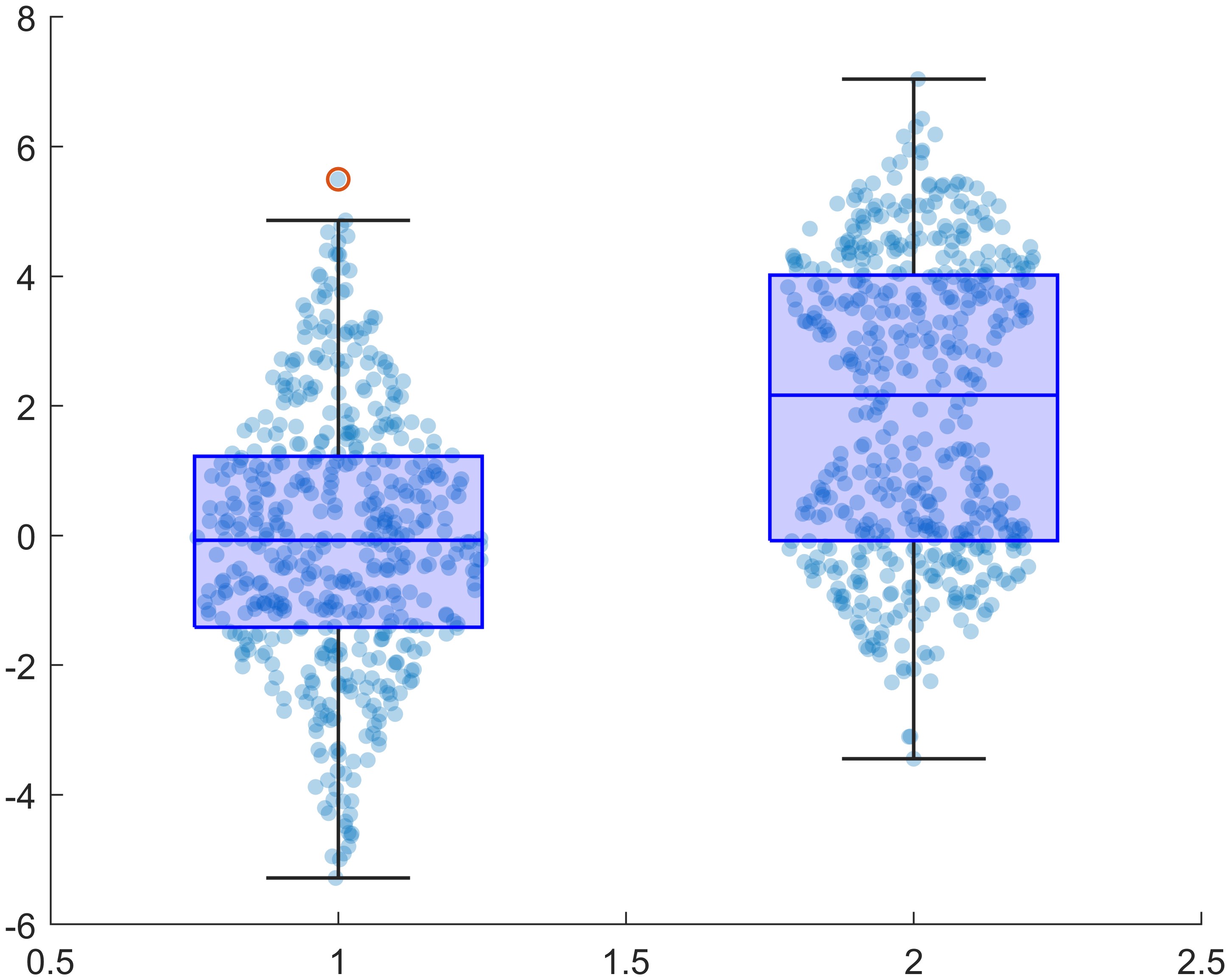
Combine using swarmchart and boxchart
I think sometimes maybe we can try to combine using swarmchart and boxchart4 to create a composite image, like:
1
2
3
4
5
6
7
8
9
10
11
12
13
14
15
16
17
18
19
clc, clear, close all

x1 = ones(1,500);
x2 = 2 * ones(1,500);
x = [x1 x2];
y1 = 2 * randn(1,500);
y2 = [randn(1,250) randn(1,250) + 4];
y = [y1 y2];


figure('Color', 'w')
hold(gca, 'on')
s = swarmchart(x,y,'filled','MarkerFaceAlpha',0.3,'MarkerEdgeAlpha',0.5,'SizeData',20);

s.XJitterWidth = 0.5;

boxchart(x, y, 'BoxFaceColor', 'b', 'BoxFaceAlpha', 0.2, 'JitterOutliers', 'off')

exportgraphics(gca, 'fig5.jpg', 'Resolution', 600)
or
1
2
3
4
% ...
s.XJitter = 'rand';
s.XJitterWidth = 0.5;
% ...
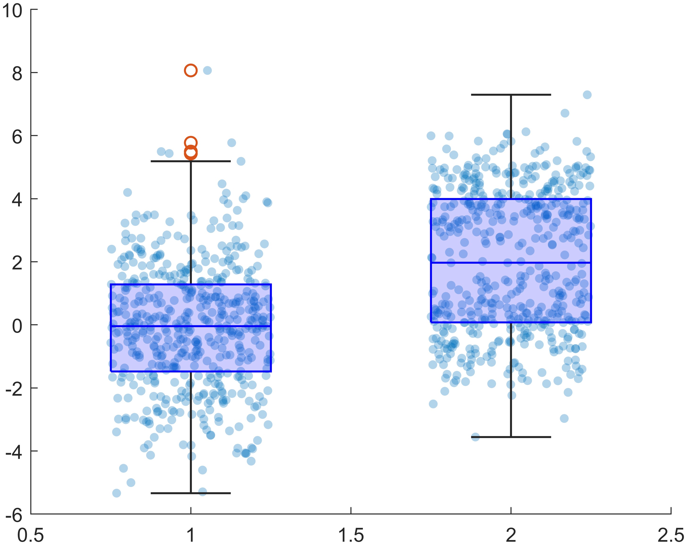
Emmm, at least not bad 😂
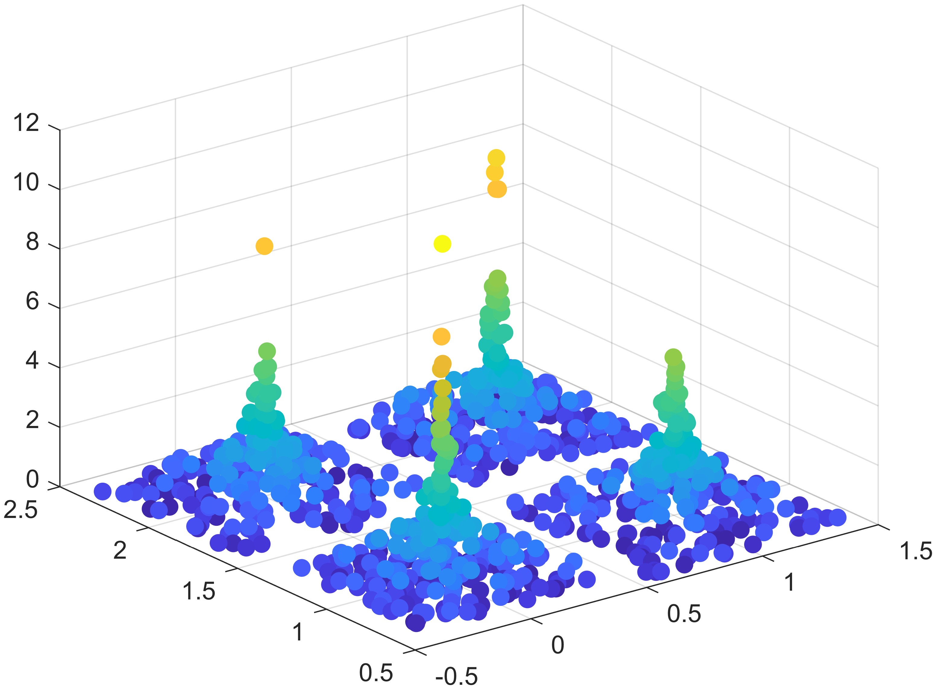
MATLAB swarmchart3 function
By the way, there is another function swarmchart35 to create a 3-D swarm scatter chart. Here is a simple example:
1
2
3
4
5
6
7
8
9
clc, clear, close all

x = [zeros(1,500) ones(1,500)];
y = randi(2,1,1000);
z = randn(1,1000).^2;
c = sqrt(z);
swarmchart3(x,y,z,50,c,'filled');

exportgraphics(gca, 'fig6.jpg', 'Resolution', 600)
References