Plot A Grouped Bar Chart using Python Matplotlib
Dec. 06, 2024 • Updated Dec. 06, 2024
A Python Matplotlib official example1 shows how to plot a grouped bar chart:
1
2
3
4
5
6
7
8
9
10
11
12
13
14
15
16
17
18
19
20
21
22
23
24
25
26
27
28
29
30
31
32
33
34
# data from https://allisonhorst.github.io/palmerpenguins/

import matplotlib.pyplot as plt
import numpy as np
%config InlineBackend.figure_format = 'svg'

species = ("Adelie", "Chinstrap", "Gentoo")
penguin_means = {
    'Bill Depth': (18.35, 18.43, 14.98),
    'Bill Length': (38.79, 48.83, 47.50),
    'Flipper Length': (189.95, 195.82, 217.19),
}

x = np.arange(len(species))  # the label locations
width = 0.25  # the width of the bars
multiplier = 0

fig, ax = plt.subplots(layout='constrained')

for attribute, measurement in penguin_means.items():
    offset = width * multiplier
    rects = ax.bar(x + offset, measurement, width, label=attribute)
    ax.bar_label(rects, padding=3)
    multiplier += 1

# Add some text for labels, title and custom x-axis tick labels, etc.
ax.set_ylabel('Length (mm)')
ax.set_title('Penguin attributes by species')
ax.set_xticks(x + width, species)
ax.legend(loc='upper left', ncols=3)
ax.set_ylim(0, 250)

plt.savefig("fig.png", dpi=900, bbox_inches='tight')
plt.show()
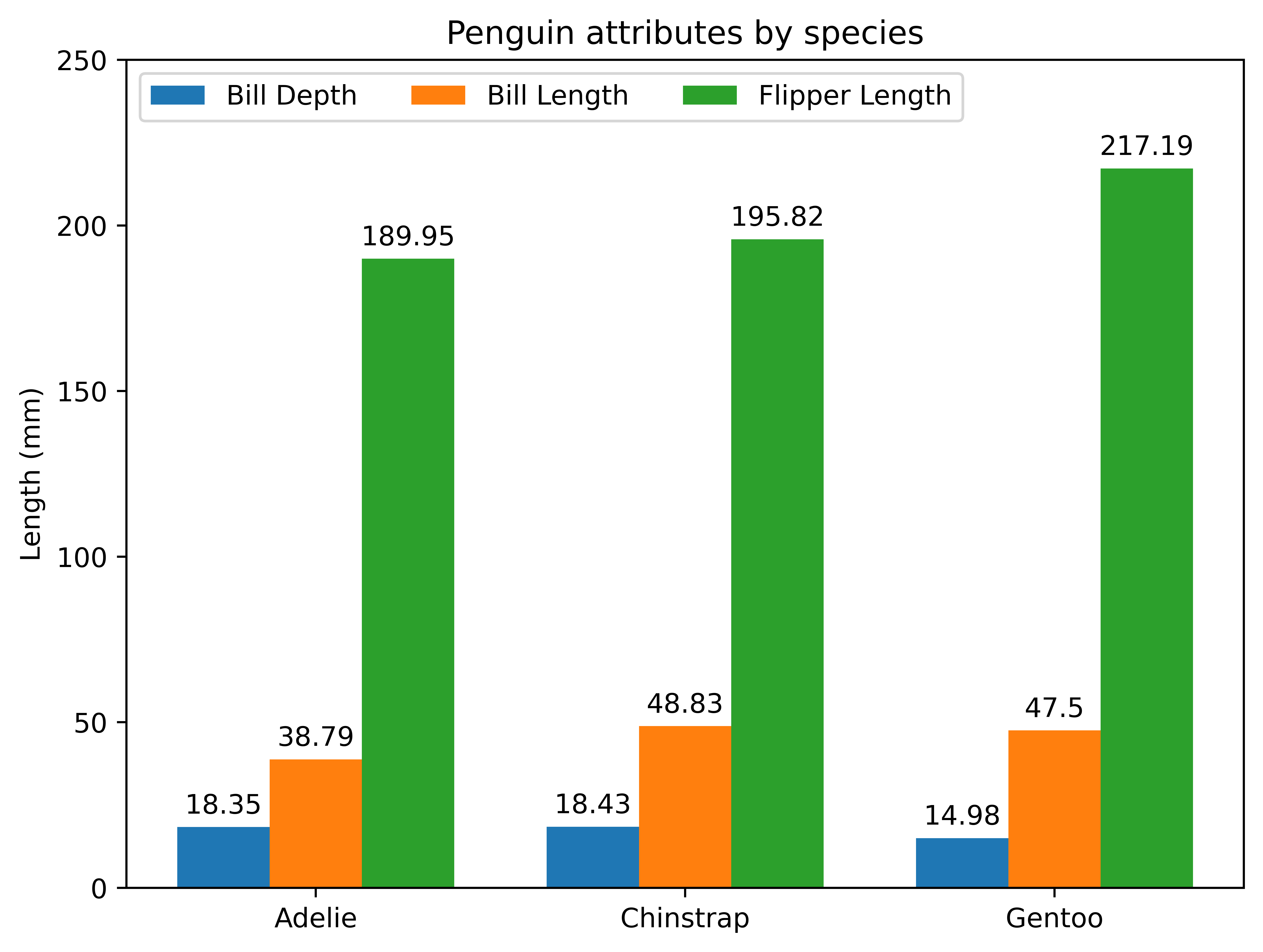
As can be seen, putting multiple sets of bars of one class in parallel is realized by an “offset”.
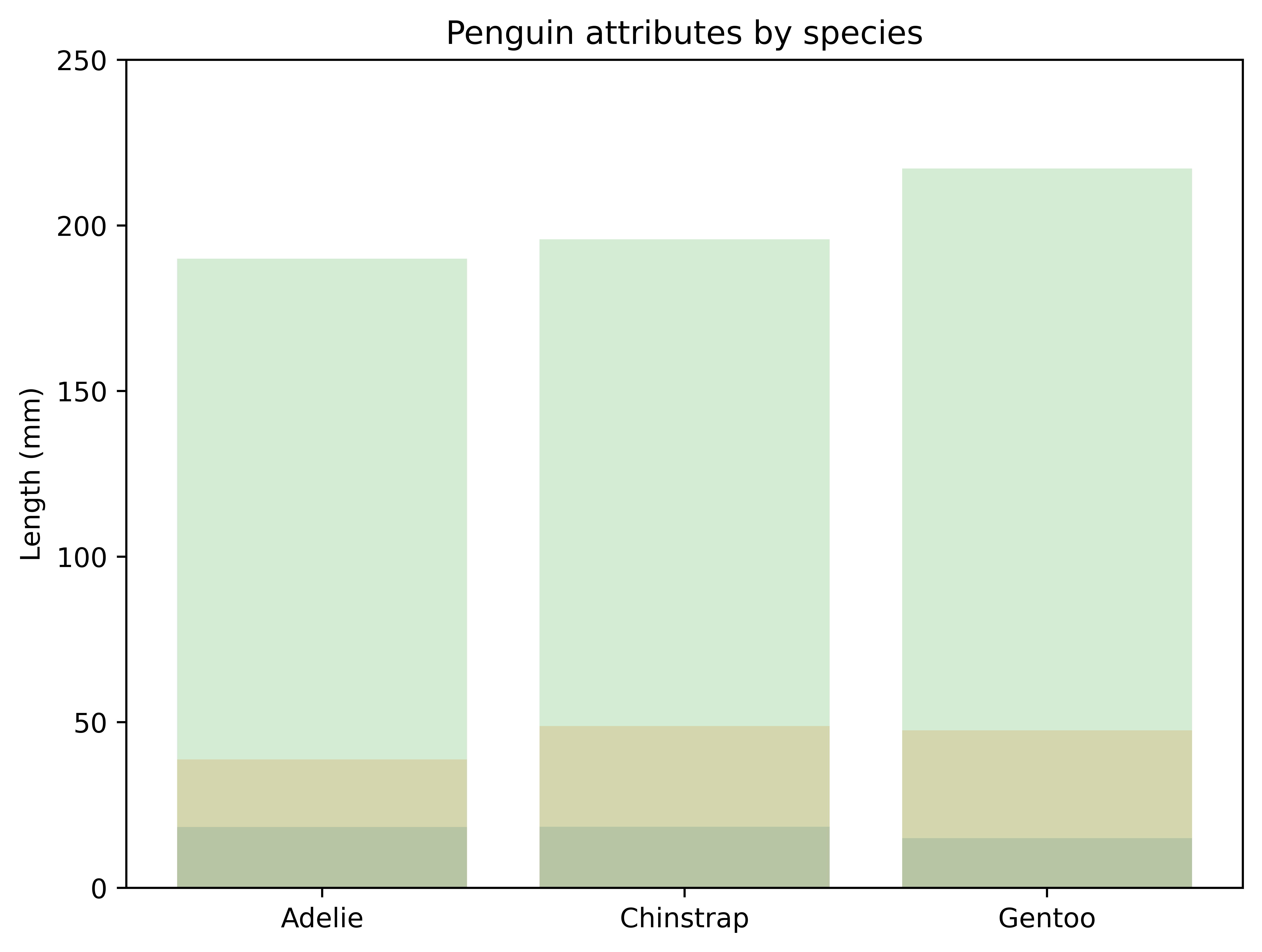
By default, bar charts will completely overlap together if we use bar function one by one:
1
2
3
4
5
6
7
8
9
10
11
12
13
14
15
16
17
18
19
20
21
22
import matplotlib.pyplot as plt
import numpy as np
%config InlineBackend.figure_format = 'svg'

species = ("Adelie", "Chinstrap", "Gentoo")
penguin_means = {
    'Bill Depth': (18.35, 18.43, 14.98),
    'Bill Length': (38.79, 48.83, 47.50),
    'Flipper Length': (189.95, 195.82, 217.19),
}

fig, ax = plt.subplots(layout='constrained')

for attribute, measurement in penguin_means.items():
    plt.bar(species, measurement, alpha=0.2)

ax.set_ylabel('Length (mm)')
ax.set_title('Penguin attributes by species')
ax.set_ylim(0, 250)

plt.savefig("fig.png", dpi=900, bbox_inches='tight')
plt.show()
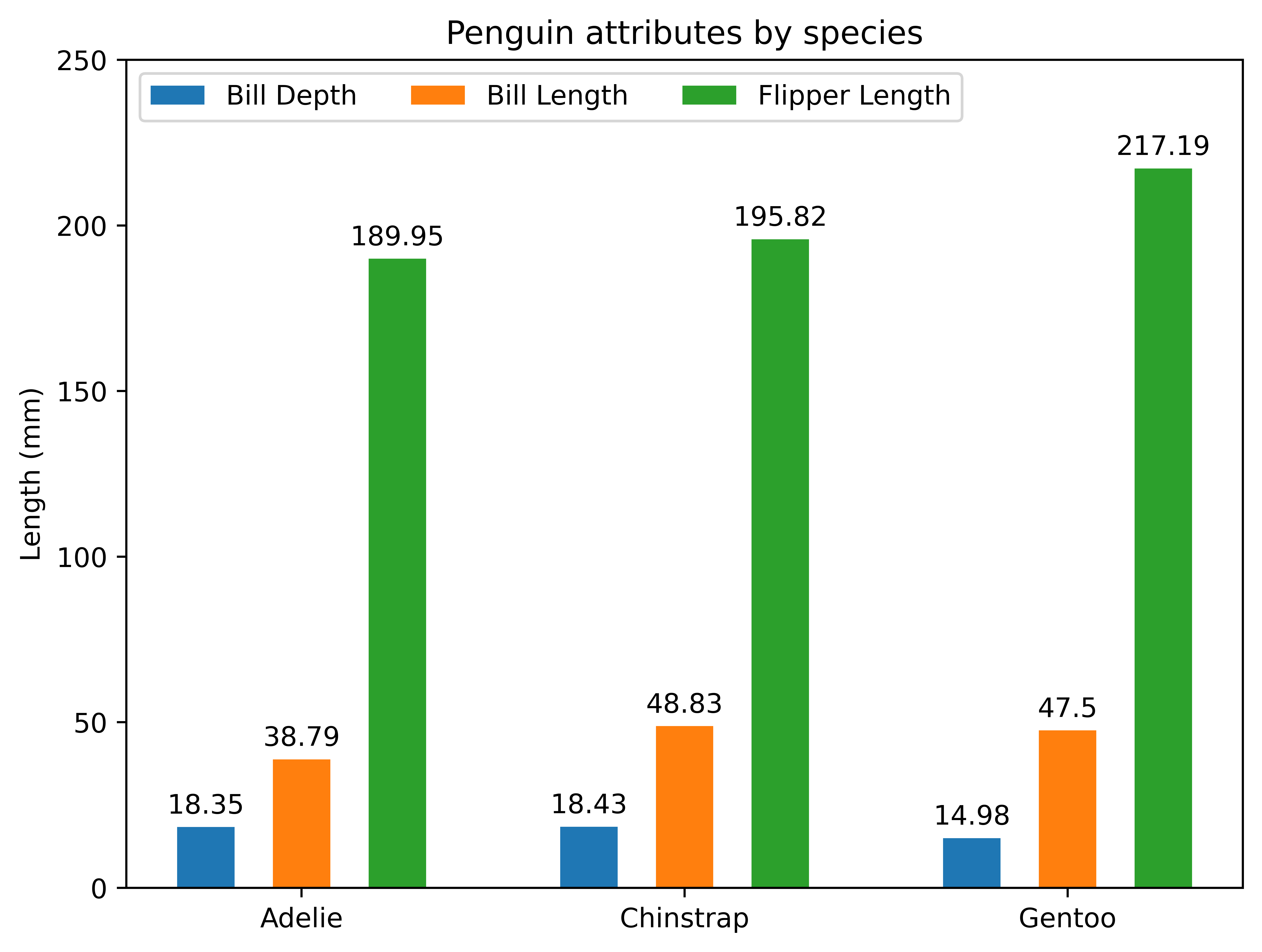
To step further, we can change the width of a bar to leave a gap between two adjacent bars:
1
2
3
4
5
6
7
8
# ...

for attribute, measurement in penguin_means.items():
    # ...
    rects = ax.bar(x + offset, measurement, 0.15, label=attribute)
    # ...

# ...
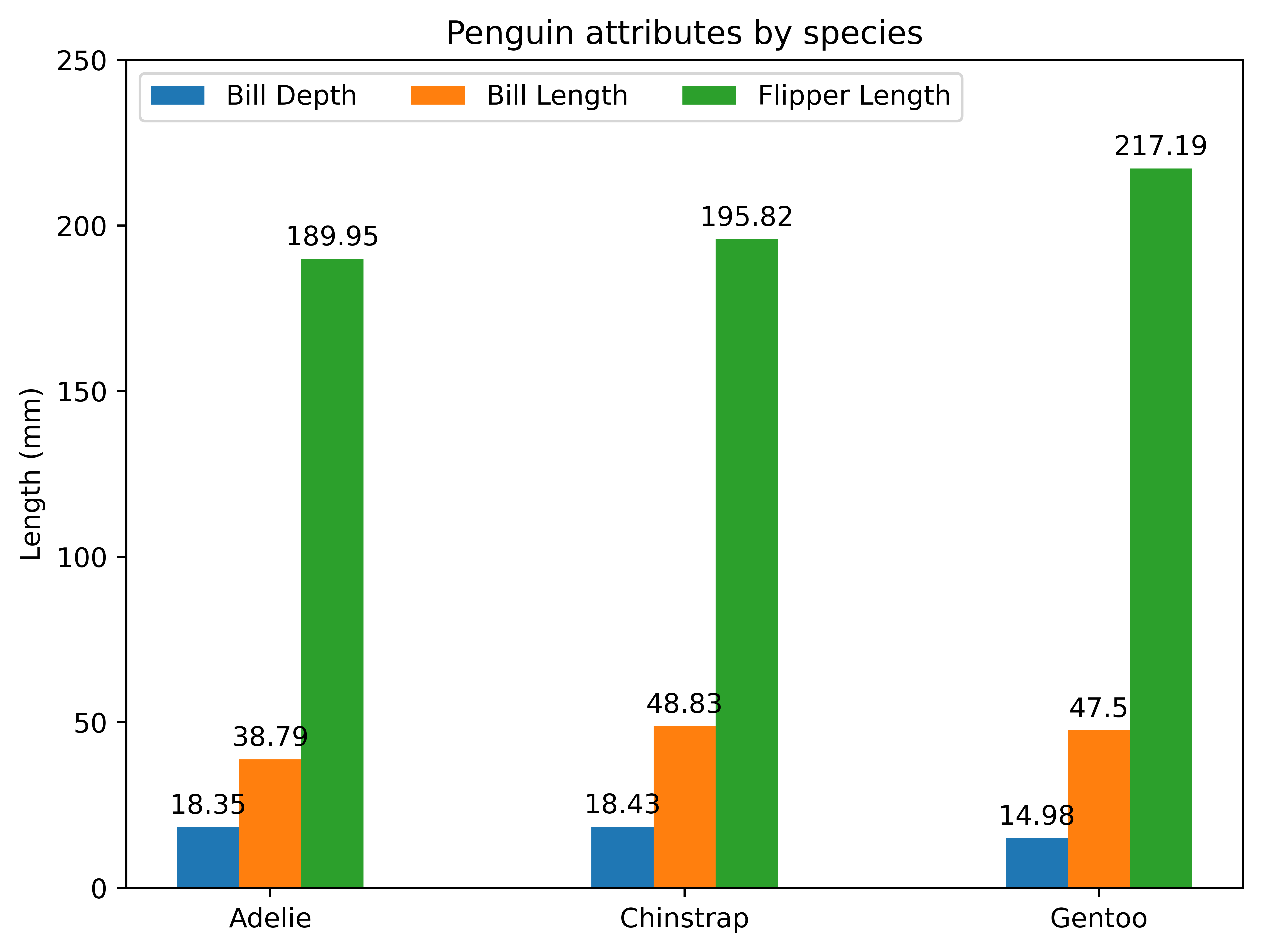
and if we just want to change the bar width with no leaving gap, we can simply change width variable, for example:
1
2
3
4
5
# ...

width = 0.15  # the width of the bars

# ...
References