Takeaways from Python Crash Course: Python Matplotlib
This post is a record made while learning Chapter 15 “Generating Data” and Chapter 16 “Downloading Data” in Eric Matthes’s book, Python Crash Course.1
Python Matplotlib
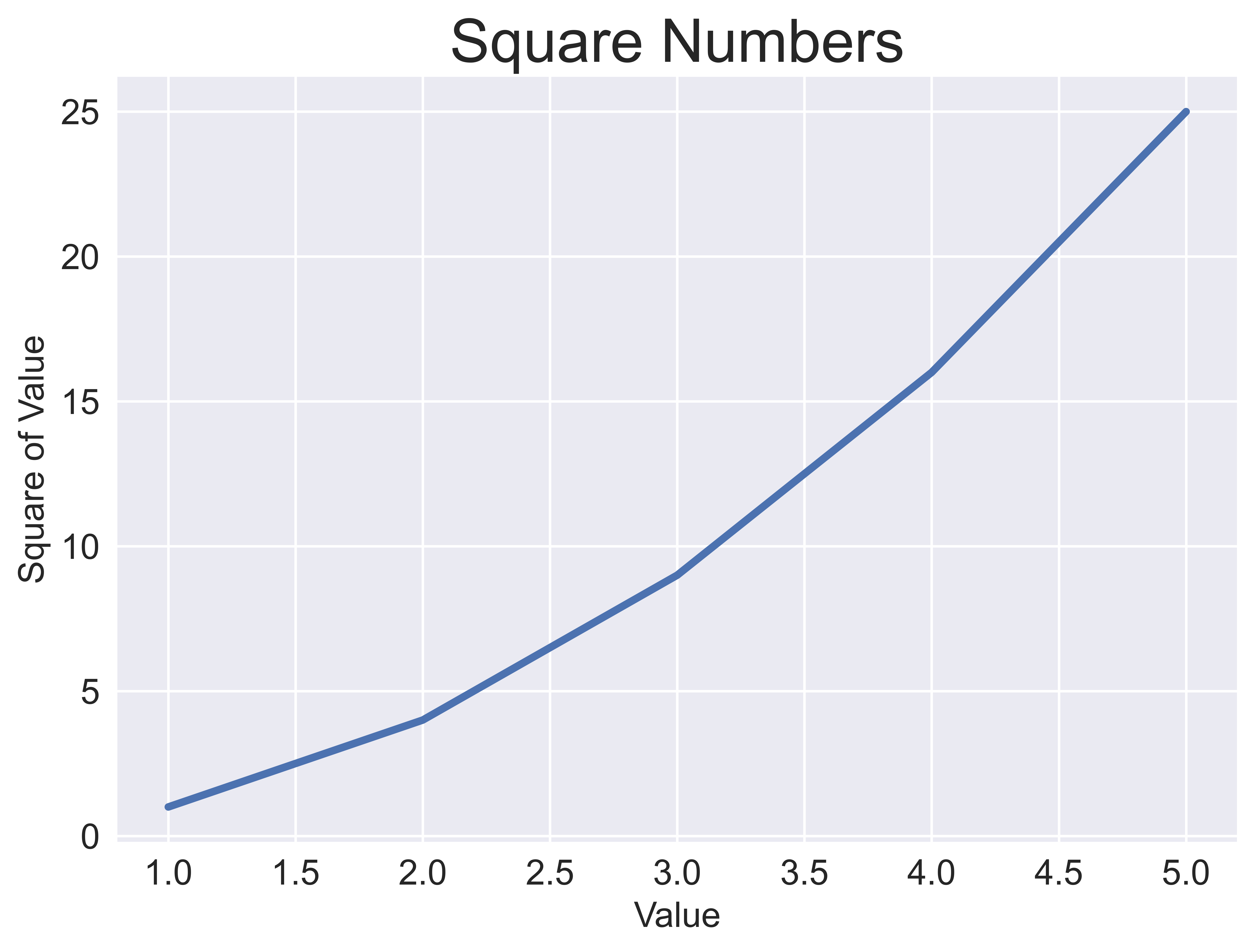
plot() function
1
2
3
4
5
6
7
8
9
10
11
12
13
14
15
16
17
18
19
20
21
import matplotlib.pyplot as plt

input_values = [1, 2, 3, 4, 5]
squares = [1, 4, 9, 16, 25]

plt.style.use('seaborn-v0_8')
fig, ax = plt.subplots()
ax.plot(input_values, squares, linewidth=3)

# Set chart title and label axes.
ax.set_title("Square Numbers", fontsize=24)
ax.set_xlabel("Value", fontsize=14)
ax.set_ylabel("Square of Value", fontsize=14)

# Set size of tick labels.
ax.tick_params(axis='both', labelsize=14)

# Save the figure.
plt.savefig("fig.png", dpi=900, bbox_inches='tight')

plt.show()
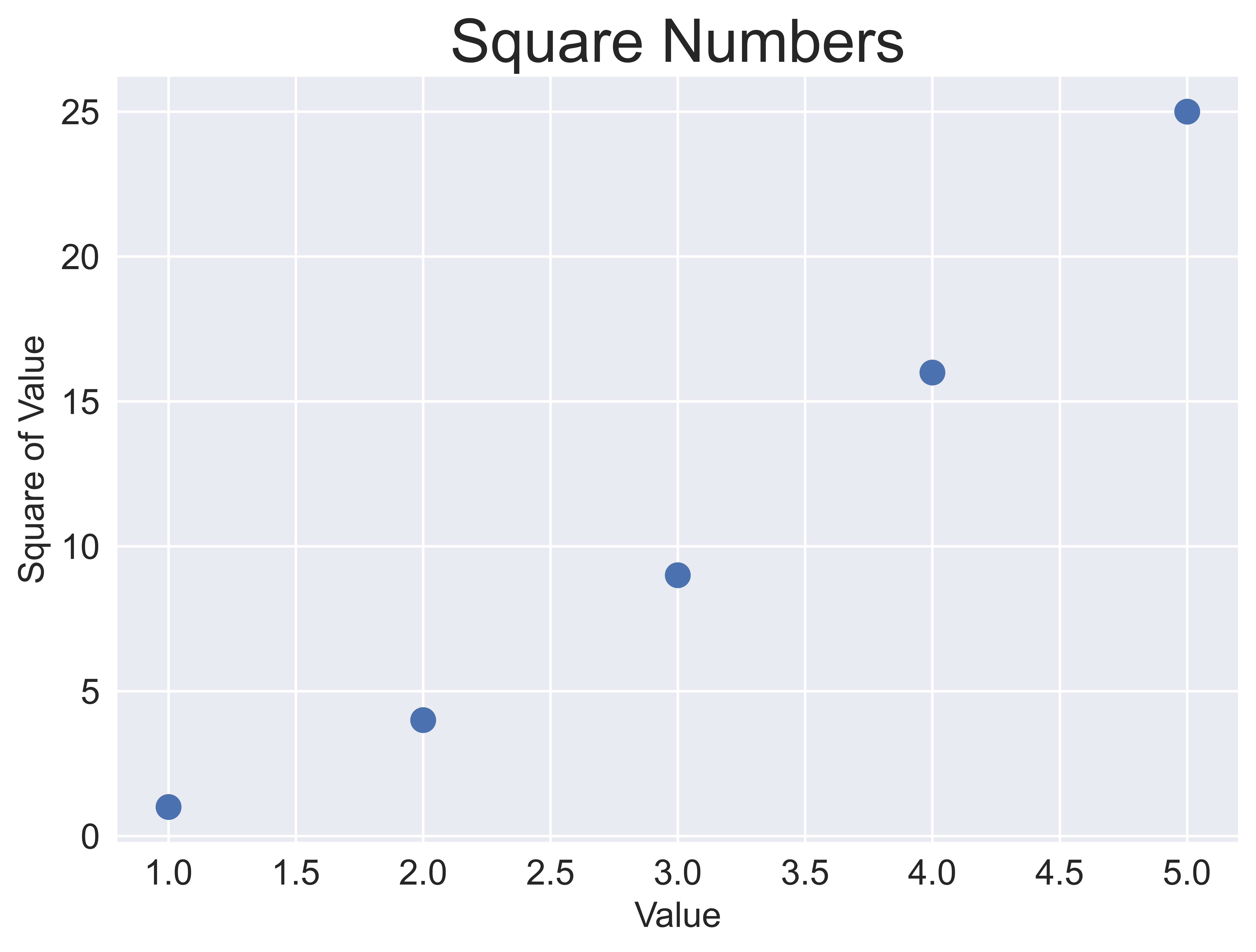
scatter() function
1
2
3
4
5
6
7
8
9
10
11
12
13
14
15
16
17
18
19
20
21
import matplotlib.pyplot as plt

x_values = [1, 2, 3, 4, 5]
y_values = [1, 4, 9, 16, 25]

plt.style.use('seaborn-v0_8')
fig, ax = plt.subplots()
ax.scatter(x_values, y_values, s=100)

# Set chart title and label axes.
ax.set_title("Square Numbers", fontsize=24)
ax.set_xlabel("Value", fontsize=14)
ax.set_ylabel("Square of Value", fontsize=14)

# Set size of tick labels.
ax.tick_params(axis='both', which='major', labelsize=14)

# Save the figure.
plt.savefig("fig.png", dpi=900, bbox_inches='tight')

plt.show()
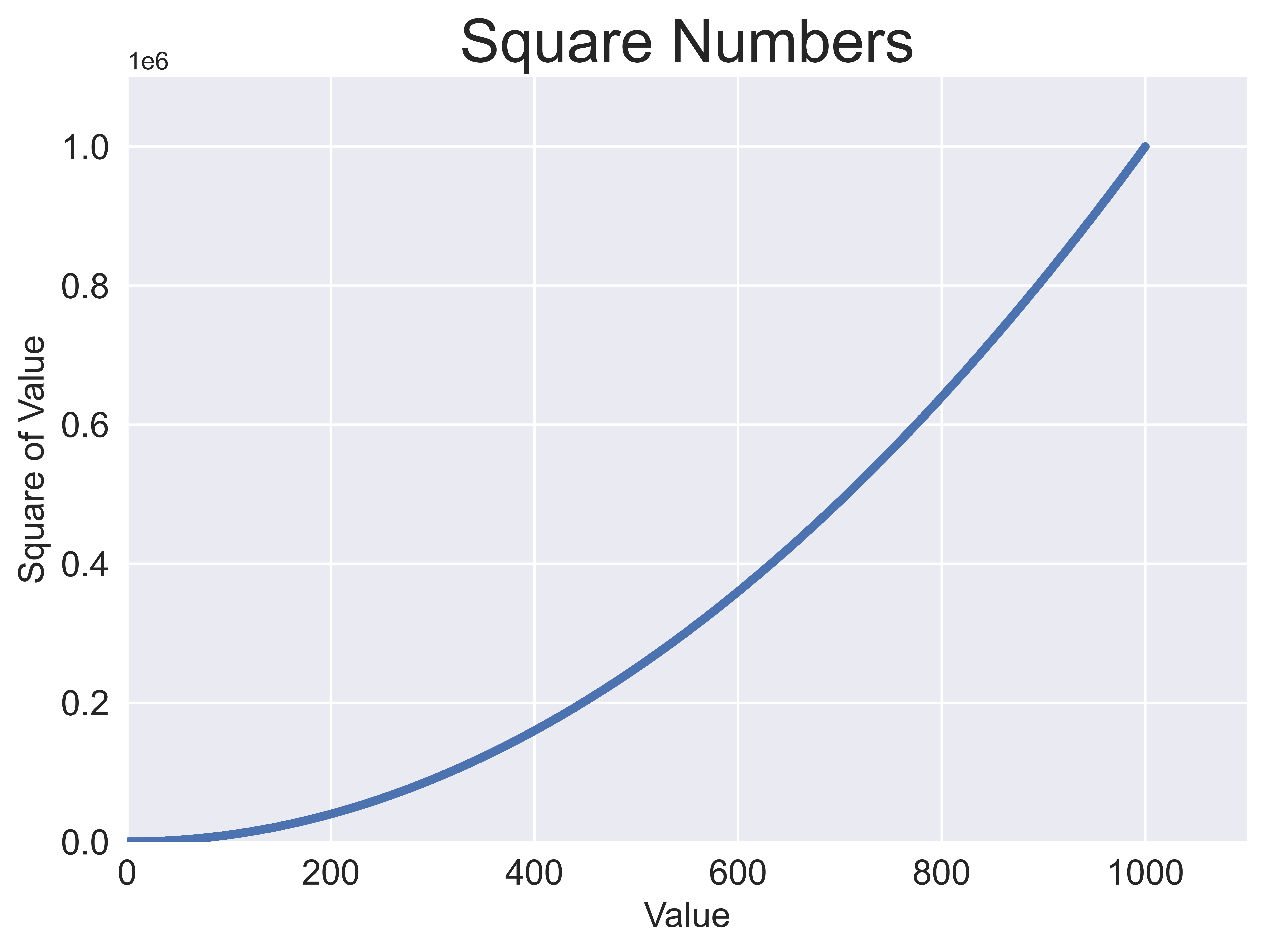
Calculate data automatically
1
2
3
4
5
6
7
8
9
10
11
12
13
14
15
16
17
18
19
20
21
22
23
24
import matplotlib.pyplot as plt

x_values = range(1, 1001)
y_values = [x**2 for x in x_values]

plt.style.use('seaborn-v0_8')
fig, ax = plt.subplots()
ax.scatter(x_values, y_values, s=10)

# Set chart title and label axes.
ax.set_title("Square Numbers", fontsize=24)
ax.set_xlabel("Value", fontsize=14)
ax.set_ylabel("Square of Value", fontsize=14)

# Set the range for each axis.
ax.axis([0, 1100, 0, 1100000])

# Set size of tick labels.
ax.tick_params(axis='both', which='major', labelsize=14)

# Save the figure.
plt.savefig("fig.png", dpi=900, bbox_inches='tight')

plt.show()
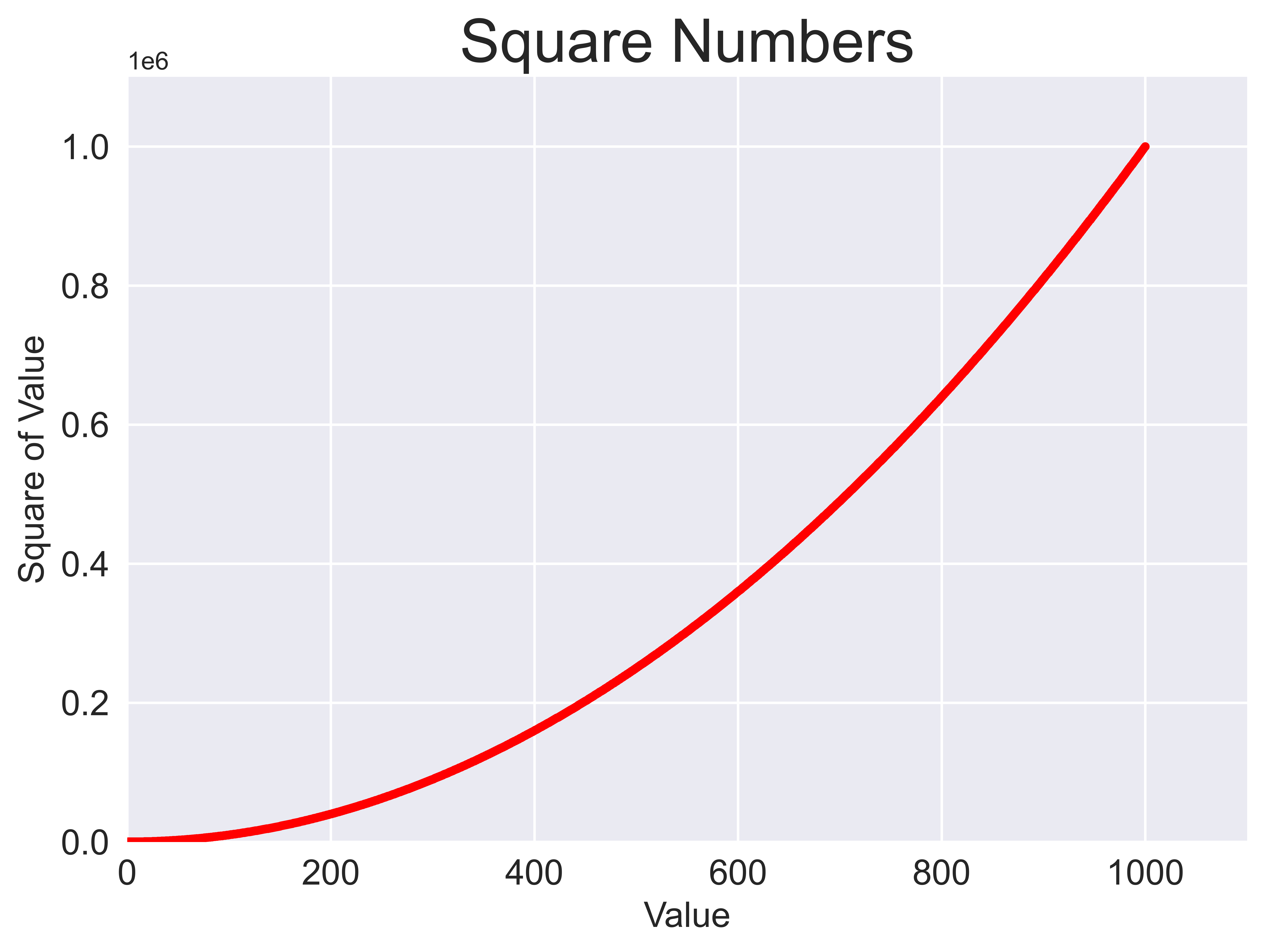
Specify the color of a plot
(1) By passing a color name to c argument of scatter() function
1
2
3
4
5
6
7
8
9
10
11
12
13
14
15
16
17
18
19
20
21
22
23
24
import matplotlib.pyplot as plt

x_values = range(1, 1001)
y_values = [x**2 for x in x_values]

plt.style.use('seaborn-v0_8')
fig, ax = plt.subplots()
ax.scatter(x_values, y_values, c='r', s=10)

# Set chart title and label axes.
ax.set_title("Square Numbers", fontsize=24)
ax.set_xlabel("Value", fontsize=14)
ax.set_ylabel("Square of Value", fontsize=14)

# Set the range for each axis.
ax.axis([0, 1100, 0, 1100000])

# Set size of tick labels.
ax.tick_params(axis='both', which='major', labelsize=14)

# Save the figure.
plt.savefig("fig.png", dpi=900, bbox_inches='tight')

plt.show()
(2) By passing RGB tuple to color argument of scatter() function
1
2
3
4
5
6
7
8
9
10
11
12
13
14
15
16
17
18
19
20
21
22
23
24
import matplotlib.pyplot as plt

x_values = range(1, 1001)
y_values = [x**2 for x in x_values]

plt.style.use('seaborn-v0_8')
fig, ax = plt.subplots()
ax.scatter(x_values, y_values, color=(0, 0.8, 0), s=10)

# Set chart title and label axes.
ax.set_title("Square Numbers", fontsize=24)
ax.set_xlabel("Value", fontsize=14)
ax.set_ylabel("Square of Value", fontsize=14)

# Set the range for each axis.
ax.axis([0, 1100, 0, 1100000])

# Set size of tick labels.
ax.tick_params(axis='both', which='major', labelsize=14)

# Save the figure.
plt.savefig("fig.png", dpi=900, bbox_inches='tight')

plt.show()
In this case, if we pass RGB tuple to c argument, rather than color:
1
ax.scatter(x_values, y_values, c=(0, 0.8, 0), s=10)
the image we’ll get is the same as above one, but a warning will occur:
1
2
C:\Users\whatastarrynight\AppData\Local\Temp\ipykernel_21080\2398875402.py:8: UserWarning: *c* argument looks like a single numeric RGB or RGBA sequence, which should be avoided as value-mapping will have precedence in case its length matches with *x* & *y*.  Please use the *color* keyword-argument or provide a 2D array with a single row if you intend to specify the same RGB or RGBA value for all points.
  ax.scatter(x_values, y_values, c=(0, 0.8, 0), s=10)
(3) By specifying colormap
A colormap is a series of colors in a gradient that moves from a starting to an ending color. We can use colormaps in visualizations to emphasize a certain pattern in the data, such as making low values a light color and high values a darker color.
1
2
3
4
5
6
7
8
9
10
11
12
13
14
15
16
17
18
19
20
21
22
23
24
import matplotlib.pyplot as plt

x_values = range(1, 1001)
y_values = [x**2 for x in x_values]

plt.style.use('seaborn-v0_8')
fig, ax = plt.subplots()
ax.scatter(x_values, y_values, c=y_values, cmap=plt.cm.Blues, s=10)

# Set chart title and label axes.
ax.set_title("Square Numbers", fontsize=24)
ax.set_xlabel("Value", fontsize=14)
ax.set_ylabel("Square of Value", fontsize=14)

# Set the range for each axis.
ax.axis([0, 1100, 0, 1100000])

# Set size of tick labels.
ax.tick_params(axis='both', which='major', labelsize=14)

# Save the figure.
plt.savefig("fig.png", dpi=900, bbox_inches='tight')

plt.show()
We can find all available colormaps provided in Matplotlib at official documentation2.
Random walk
A random walk is a path that has no clear direction but is determined by a series of random decisions, each of which is left entirely to chance.
RandomWalk class
1
2
3
4
5
6
7
8
9
10
11
12
13
14
15
16
17
18
19
20
21
22
23
24
25
26
27
28
29
30
31
32
33
34
35
36
37
from random import choice

class RandomWalk:
    """A class to generate random walks."""

    def __init__(self, num_points=5000):
        """Initialize attributes of a walk."""
        self.num_points = num_points

        # All walks start at (0, 0)
        self.x_values = [0]
        self.y_values = [0]

    def fill_walk(self):
        """Calculate all the points in the walk."""

        # Keep taking steps until the walk reaches the desired length.
        while len(self.x_values) < self.num_points:
            # Decide which direction to go and how far to go in that direction.
            x_direction = choice([1, -1])
            x_distance = choice([0, 1, 2, 3, 4])
            x_step = x_direction * x_distance

            y_direction = choice([1, -1])
            y_distance = choice([0, 1, 2, 3, 4])
            y_step = y_direction * y_distance

            # Reject moves that go nowhere.
            if x_step == 0 and y_step == 0:
                continue

            # Calculate the new position.
            x = self.x_values[-1] + x_step
            y = self.y_values[-1] + y_step

            self.x_values.append(x)
            self.y_values.append(y)
where choice() method3:
The choice() method returns a randomly selected element from the specified sequence.
The sequence can be a string, a range, a list, a tuple or any other kind of sequence.
1
2
3
4
5
6
7
8
9
10
11
12
13
14
15
import matplotlib.pyplot as plt

# Make a random walk.
rw = RandomWalk()
rw.fill_walk()

# Plot the points in the walk.
plt.style.use('classic')
fig, ax = plt.subplots()
ax.scatter(rw.x_values, rw.y_values, s=15)

# Save the figure.
plt.savefig("fig.png", dpi=900, bbox_inches='tight')

plt.show()
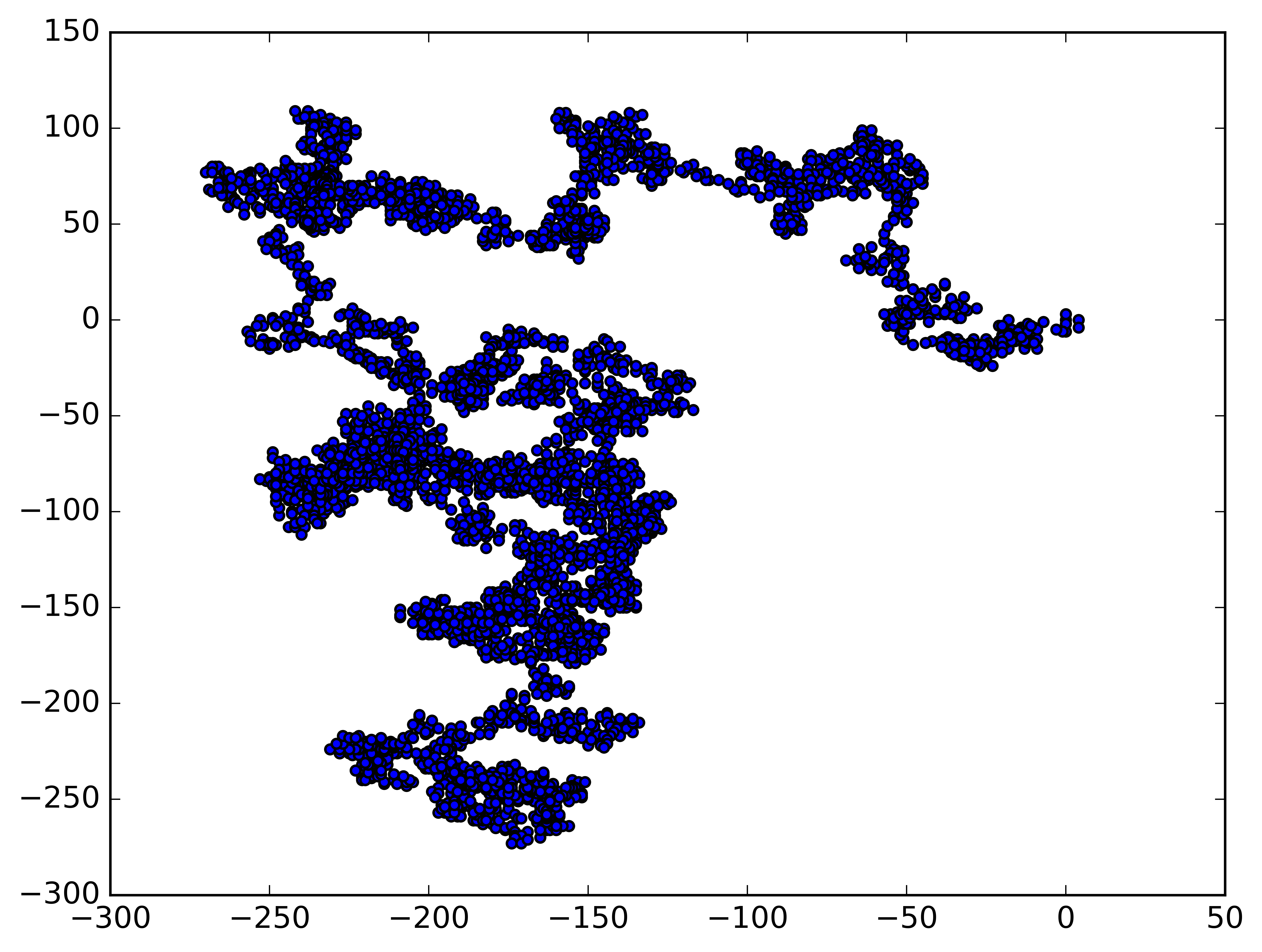
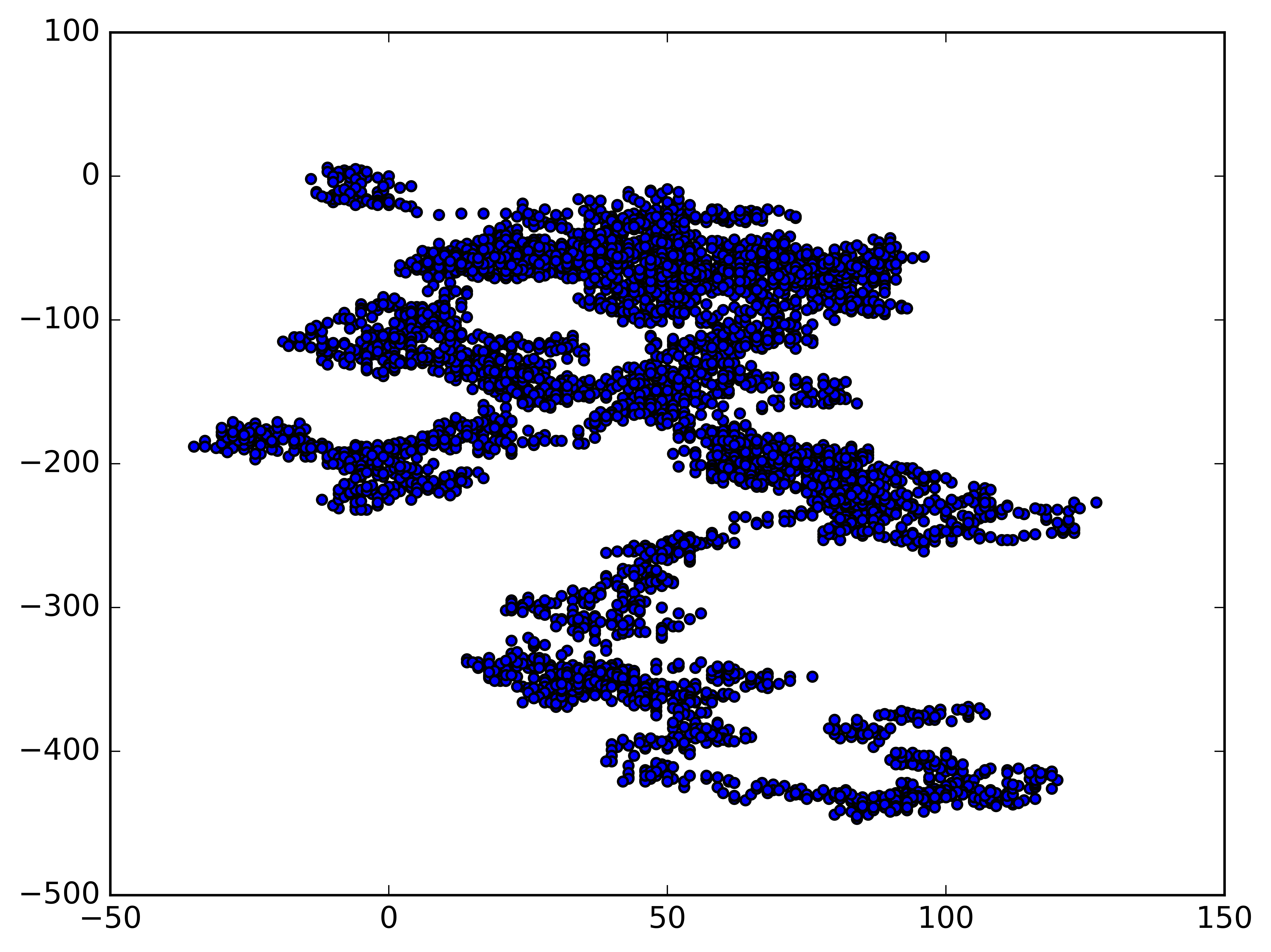
Generate multiple random walks
Every random walk is different, and it’s fun to explore the various patterns that can be generated by put preceding code into a while loop:
1
2
3
4
5
6
7
8
9
10
11
12
13
14
15
16
17
18
19
20
21
22
23
24
import matplotlib.pyplot as plt

idx = 0

# Keep making new walks, as long as the program is active.
while True:
    # Make a random walk.
    rw = RandomWalk()
    rw.fill_walk()

    # Plot the points in the walk.
    plt.style.use('classic')
    fig, ax = plt.subplots()
    ax.scatter(rw.x_values, rw.y_values, s=15)

    # Save the figure.
    plt.savefig(f"fig{idx}.png", dpi=900, bbox_inches='tight')
    idx += 1

    plt.show()

    keep_running = input("Make another walk? (y/n): ")
    if keep_running == 'n':
        break
1
Make another walk? (y/n): y
1
Make another walk? (y/n): y
1
Make another walk? (y/n): n
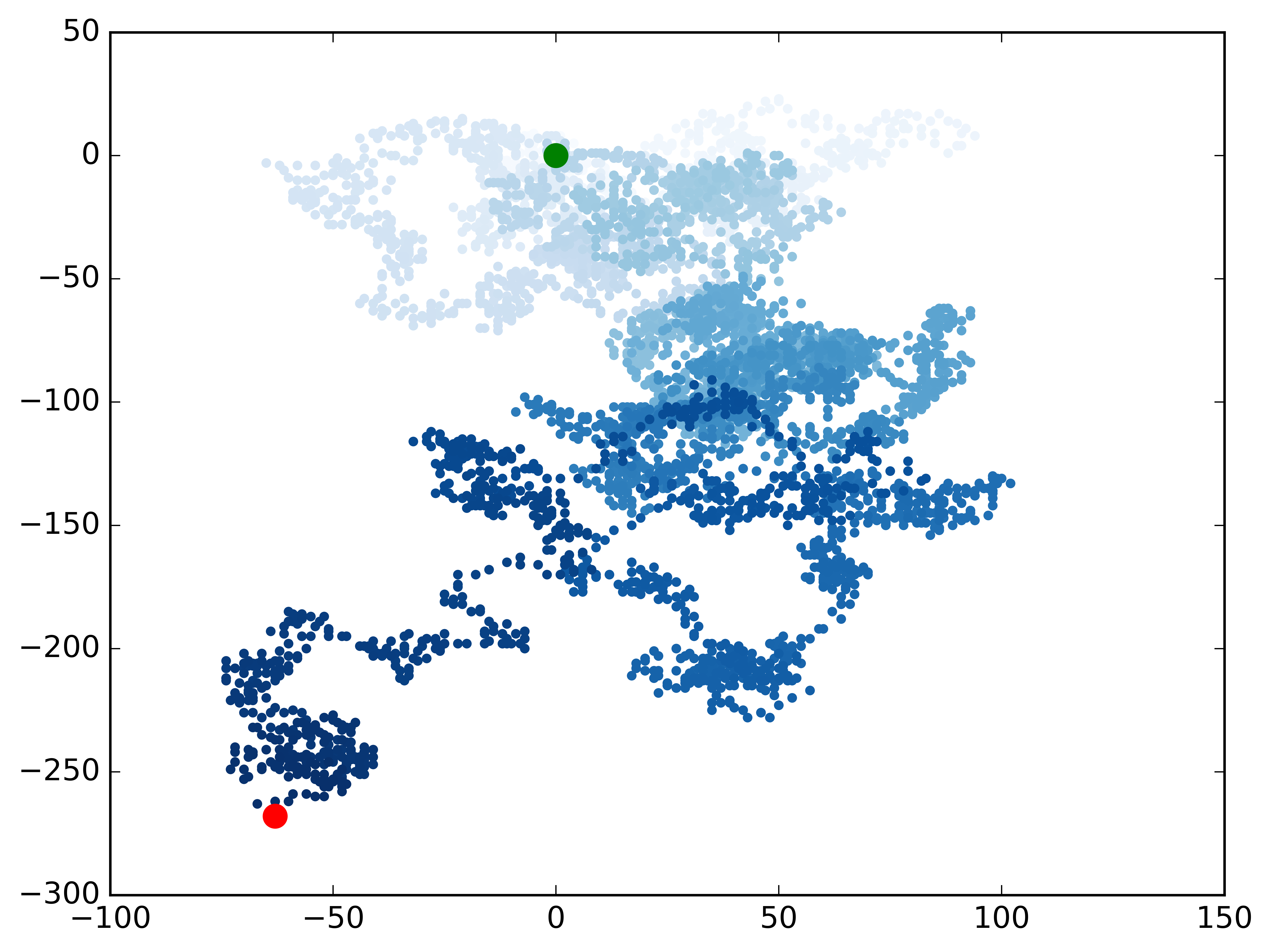
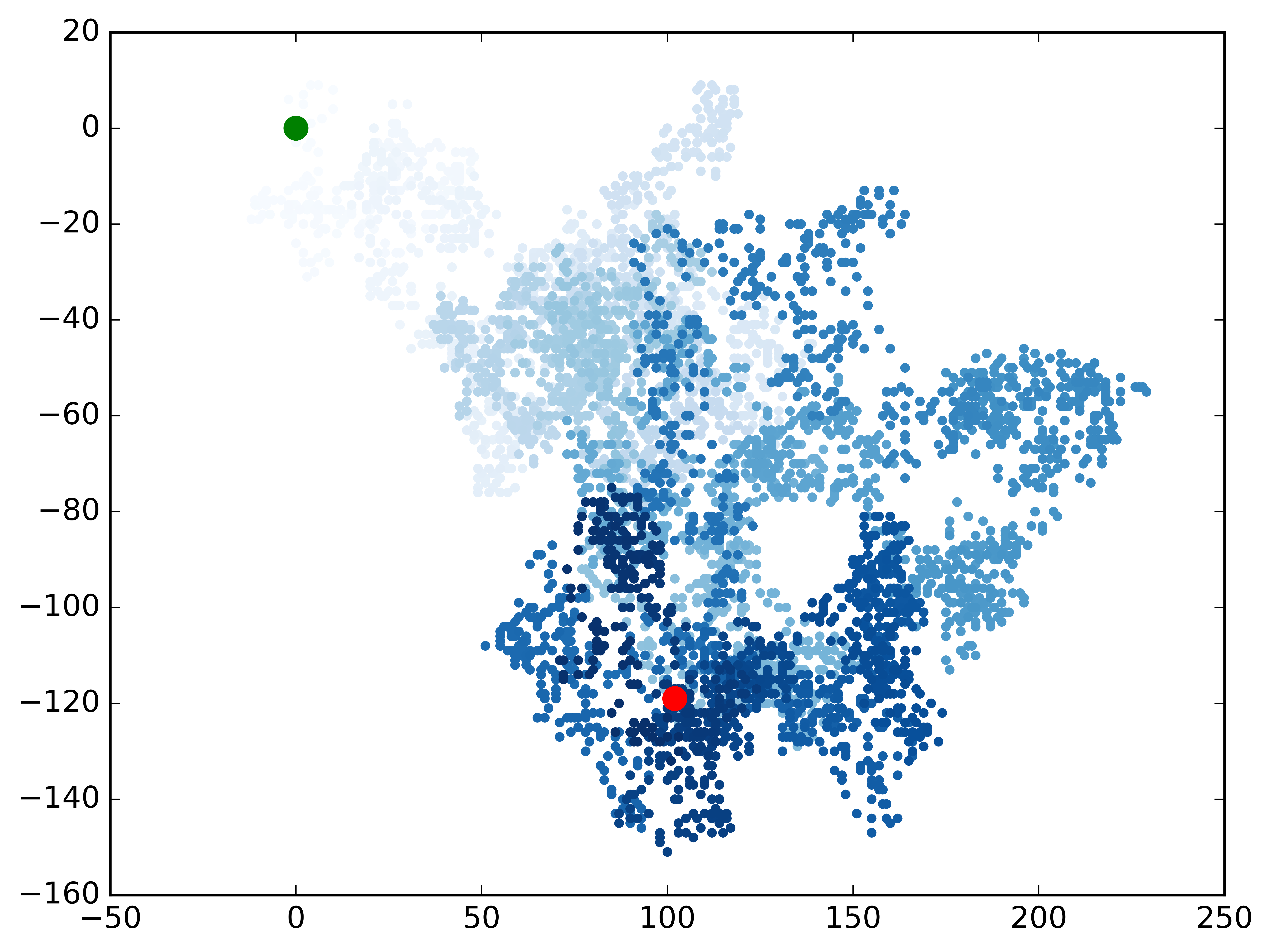
Color data points & emphasize the starting and ending points
1
2
3
4
5
6
7
8
9
10
11
12
13
14
15
16
17
18
19
20
21
22
23
24
25
26
27
28
29
30
31
import matplotlib.pyplot as plt

idx = 0

# Keep making new walks, as long as the program is active.
while True:
    # Make a random walk.
    rw = RandomWalk()
    rw.fill_walk()

    # Plot the points in the walk.
    plt.style.use('classic')
    fig, ax = plt.subplots()
    point_numbers = range(rw.num_points)
    ax.scatter(rw.x_values, rw.y_values, c=point_numbers, cmap=plt.cm.Blues,
               edgecolors='none', s=15)

    # Emphasize the first and last points.
    ax.scatter(0, 0, c='green', edgecolors='none', s=100)
    ax.scatter(rw.x_values[-1], rw.y_values[-1], c='red', edgecolors='none',
               s=100)

    # Save the figure.
    plt.savefig(f"fig{idx}.png", dpi=900, bbox_inches='tight')
    idx += 1

    plt.show()

    keep_running = input("Make another walk? (y/n): ")
    if keep_running == 'n':
        break
1
Make another walk? (y/n): y
1
Make another walk? (y/n): y
1
Make another walk? (y/n): n
Remove the axes
1
2
3
4
5
6
7
8
9
10
11
12
13
14
15
16
17
18
19
20
21
22
23
24
25
26
27
28
29
30
31
32
33
34
35
import matplotlib.pyplot as plt

idx = 0

# Keep making new walks, as long as the program is active.
while True:
    # Make a random walk.
    rw = RandomWalk()
    rw.fill_walk()

    # Plot the points in the walk.
    plt.style.use('classic')
    fig, ax = plt.subplots()
    point_numbers = range(rw.num_points)
    ax.scatter(rw.x_values, rw.y_values, c=point_numbers, cmap=plt.cm.Blues,
               edgecolors='none', s=15)

    # Emphasize the first and last points.
    ax.scatter(0, 0, c='green', edgecolors='none', s=100)
    ax.scatter(rw.x_values[-1], rw.y_values[-1], c='red', edgecolors='none',
               s=100)

    # Remove the axes.
    ax.get_xaxis().set_visible(False)
    ax.get_yaxis().set_visible(False)

    # Save the figure.
    plt.savefig(f"fig{idx}.png", dpi=900, bbox_inches='tight')
    idx += 1

    plt.show()

    keep_running = input("Make another walk? (y/n): ")
    if keep_running == 'n':
        break
Alter the figure size to fill the screen
A visualization is much more effective at communicating patterns in data if it fits nicely on the screen.
1
2
3
4
5
6
7
8
9
10
11
12
13
14
15
16
17
18
19
20
21
22
23
24
25
26
27
28
29
30
31
32
33
34
35
import matplotlib.pyplot as plt

idx = 0

# Keep making new walks, as long as the program is active.
while True:
    # Make a random walk.
    rw = RandomWalk()
    rw.fill_walk()

    # Plot the points in the walk.
    plt.style.use('classic')
    fig, ax = plt.subplots(figsize=(15, 9))
    point_numbers = range(rw.num_points)
    ax.scatter(rw.x_values, rw.y_values, c=point_numbers, cmap=plt.cm.Blues,
               edgecolors='none', s=15)

    # Emphasize the first and last points.
    ax.scatter(0, 0, c='green', edgecolors='none', s=100)
    ax.scatter(rw.x_values[-1], rw.y_values[-1], c='red', edgecolors='none',
               s=100)

    # Remove the axes.
    ax.get_xaxis().set_visible(False)
    ax.get_yaxis().set_visible(False)

    # Save the figure.
    plt.savefig(f"fig{idx}.png", dpi=900, bbox_inches='tight')
    idx += 1

    plt.show()

    keep_running = input("Make another walk? (y/n): ")
    if keep_running == 'n':
        break
When creating the plot, we can pass a figsize argument to set figure size. The figsize parameter takes a tuple, which tells Matplotlib the dimensions of the plotting window in inches.
Matplotlib assumes that screen resolution is 100 pixels per inch; if this code doesn’t give an accurate plot size, adjust the numbers as necessary. Or, if we know our system’s resolution, pass plt.subplots() the resolution using the dpi parameter to set a plot size that makes effective use of the space available on the screen, as shown here:
1
2
3
4
5
6
7
8
9
10
11
12
13
14
15
16
17
18
19
20
21
22
23
24
25
26
27
28
29
30
31
32
33
idx = 0

# Keep making new walks, as long as the program is active.
while True:
    # Make a random walk.
    rw = RandomWalk()
    rw.fill_walk()

    # Plot the points in the walk.
    plt.style.use('classic')
    fig, ax = plt.subplots(figsize=(15, 9), dpi=128)
    point_numbers = range(rw.num_points)
    ax.scatter(rw.x_values, rw.y_values, c=point_numbers, cmap=plt.cm.Blues,
               edgecolors='none', s=15)

    # Emphasize the first and last points.
    ax.scatter(0, 0, c='green', edgecolors='none', s=100)
    ax.scatter(rw.x_values[-1], rw.y_values[-1], c='red', edgecolors='none',
               s=100)

    # Remove the axes.
    ax.get_xaxis().set_visible(False)
    ax.get_yaxis().set_visible(False)

    # Save the figure.
    plt.savefig(f"fig{idx}.png", dpi=900, bbox_inches='tight')
    idx += 1

    plt.show()

    keep_running = input("Make another walk? (y/n): ")
    if keep_running == 'n':
        break

Plot the data in CSV file
The CSV files used in the following code can be got from GitHub repo4.
Parse the CSV file headers
One simple way to store data in a text file is to write the data as a series of values separated by commas, which is called comma-separated values. The resulting files are called CSV files. The CSV file sitka_weather_07-2018_simple.csv, for example, which stores a collection of weather data, looks like:
1
2
3
4
5
6
7
8
"STATION","NAME","DATE","PRCP","TAVG","TMAX","TMIN"
"USW00025333","SITKA AIRPORT, AK US","2018-07-01","0.25",,"62","50"
"USW00025333","SITKA AIRPORT, AK US","2018-07-02","0.01",,"58","53"
"USW00025333","SITKA AIRPORT, AK US","2018-07-03","0.00",,"70","54"
"USW00025333","SITKA AIRPORT, AK US","2018-07-04","0.00",,"70","55"
"USW00025333","SITKA AIRPORT, AK US","2018-07-05","0.00",,"67","55"
"USW00025333","SITKA AIRPORT, AK US","2018-07-06","0.00",,"59","55"
"USW00025333","SITKA AIRPORT, AK US","2018-07-07","0.00",,"58","55"
The first line in the file is its header, and we can extract it by using Python code:
1
2
3
4
5
6
7
import csv

filename = 'data/sitka_weather_07-2018_simple.csv'
with open(filename) as f:
    reader = csv.reader(f)
    header_row = next(reader)
    print(header_row)
1
['STATION', 'NAME', 'DATE', 'PRCP', 'TAVG', 'TMAX', 'TMIN']
Here, we take the file object f as an argument of the csv.reader() function to create a reader object reader associated with that file. Then, pass the reader object reader to the next() function provided by csv module to return the next line in the file to variable header_row. Because we call next() only once, header_row represents the first line of the file, i.e. the file headers which tell us what information each column of data holds.
Calling next() function more times can help us get more lines of the file:
1
2
3
4
5
6
7
8
import csv

filename = 'data/sitka_weather_07-2018_simple.csv'
with open(filename) as f:
    reader = csv.reader(f)

    for idx in range(3):
        print(next(reader))
1
2
3
['STATION', 'NAME', 'DATE', 'PRCP', 'TAVG', 'TMAX', 'TMIN']
['USW00025333', 'SITKA AIRPORT, AK US', '2018-07-01', '0.25', '', '62', '50']
['USW00025333', 'SITKA AIRPORT, AK US', '2018-07-02', '0.01', '', '58', '53']
Go further, we can parse file headers and label their positions by:
1
2
3
4
5
6
7
8
9
import csv

filename = 'data/sitka_weather_07-2018_simple.csv'
with open(filename) as f:
    reader = csv.reader(f)
    header_row = next(reader)

    for index, column_header in enumerate(header_row):
        print(index, column_header)
1
2
3
4
5
6
7
0 STATION
1 NAME
2 DATE
3 PRCP
4 TAVG
5 TMAX
6 TMIN
The enumerate() function returns both the index index and the value column_header of each item as we loop through the list header_row. This syntax is actually commonly used.
Extract and read data
1
2
3
4
5
6
7
8
9
10
11
12
13
14
import csv

filename = 'data/sitka_weather_07-2018_simple.csv'
with open(filename) as f:
    reader = csv.reader(f)
    header_row = next(reader)

    # Get high temperatures from this file.
    highs = []
    for row in reader:
        high = int(row[5])
        highs.append(high)

print(highs)
1
[62, 58, 70, 70, 67, 59, 58, 62, 66, 59, 56, 63, 65, 58, 56, 59, 64, 60, 60, 61, 65, 65, 63, 59, 64, 65, 68, 66, 64, 67, 65]
We make an empty list called highs and then loop through the remaining rows in the file. The reader object reader continues from where it left off in the CSV file and automatically returns each line following its current position. Because we’ve already read the header row, the loop will begin at the second line where the actual data begins. On each pass through the loop, we pull the data from index 5, which corresponds to the header TMAX, assign the data to the variable high, use the int() function to convert it to numerical format, and finally append the value to highs.
Plot data in a temperature chart
1
2
3
4
5
6
7
8
9
10
11
12
13
14
15
16
17
18
19
20
21
22
23
24
25
26
27
28
29
import csv
import matplotlib.pyplot as plt

filename = 'data/sitka_weather_07-2018_simple.csv'
with open(filename) as f:
    reader = csv.reader(f)
    header_row = next(reader)

    # Get high temperatures from this file.
    highs = []
    for row in reader:
        high = int(row[5])
        highs.append(high)

# Plot the high temperatures.
plt.style.use('seaborn-v0_8')
fig, ax = plt.subplots()
ax.plot(highs, c='red')

# Format plot.
plt.title("Daily high temperatures, July 2018", fontsize=24)
plt.xlabel('', fontsize=16)
plt.ylabel("Temperature (F)", fontsize=16)
plt.tick_params(axis='both', which='major', labelsize=16)

# Save the figure.
plt.savefig("fig.png", dpi=900, bbox_inches='tight')

plt.show()
Plot as date
A more precise data visualization is plotting how data changes as specific date:
Use strptime() method in the datetime module to convert the string containing the date to a formatted date.
1
2
3
4
from datetime import datetime

first_date = datetime.strptime('2018-07-01', '%Y-%m-%d')
print(first_date)
1
2018-07-01 00:00:00
Date and Time Formatting Arguments from the datetime Module
%A, Weekday name, such as Monday%B, Month name, such as January%m, Month, as a number%d, Day of the month, as a number%Y, Four-digit year%y, Two-digit year%H, Hour, in 24-hour format%I, Hour, in 12-hour format%p,AMorPM%M, Minutes%S, Seconds
1
2
3
4
5
6
7
8
9
10
11
12
13
14
15
16
17
18
19
20
21
22
23
24
25
26
27
28
29
30
31
32
33
34
import csv
from datetime import datetime
import matplotlib.pyplot as plt

filename = 'data/sitka_weather_07-2018_simple.csv'

with open(filename) as f:
    reader = csv.reader(f)
    header_row = next(reader)

    # Get dates and high temperatures from this file.
    dates, highs = [], []
    for row in reader:
        current_date = datetime.strptime(row[2], '%Y-%m-%d')
        high = int(row[5])
        dates.append(current_date)
        highs.append(high)

# Plot the high temperatures.
plt.style.use('seaborn-v0_8')
fig, ax = plt.subplots()
ax.plot(dates, highs, c='red')

# Format plot.
plt.title("Daily high temperatures, July 2018", fontsize=24)
plt.xlabel('', fontsize=16)
fig.autofmt_xdate()
plt.ylabel("Temperature (F)", fontsize=16)
plt.tick_params(axis='both', which='major', labelsize=16)

# Save the figure.
plt.savefig("fig.png", dpi=900, bbox_inches='tight')

plt.show()
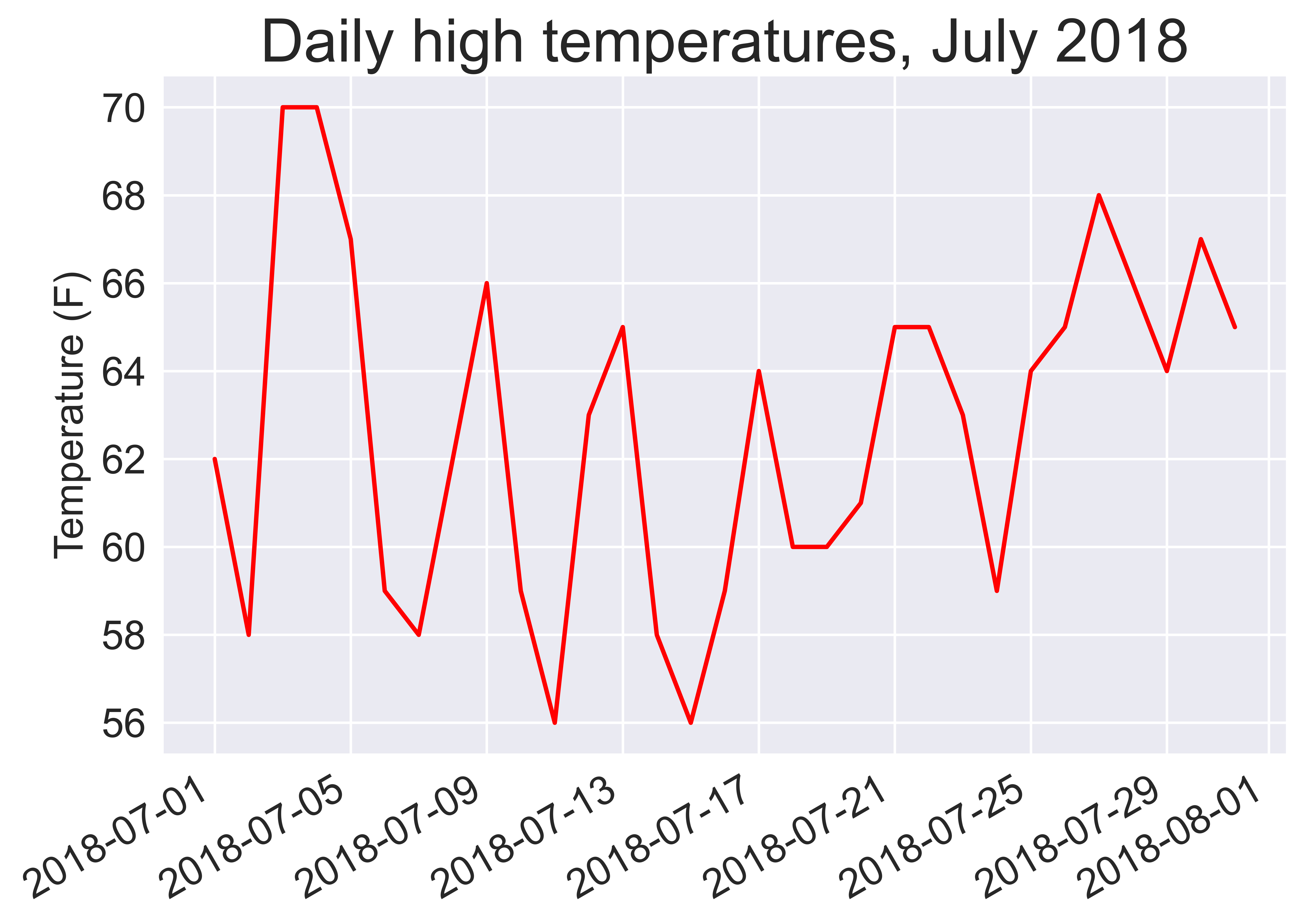
where fig.autofmt_xdate() function draws the date labels diagonally to prevent them from overlapping.
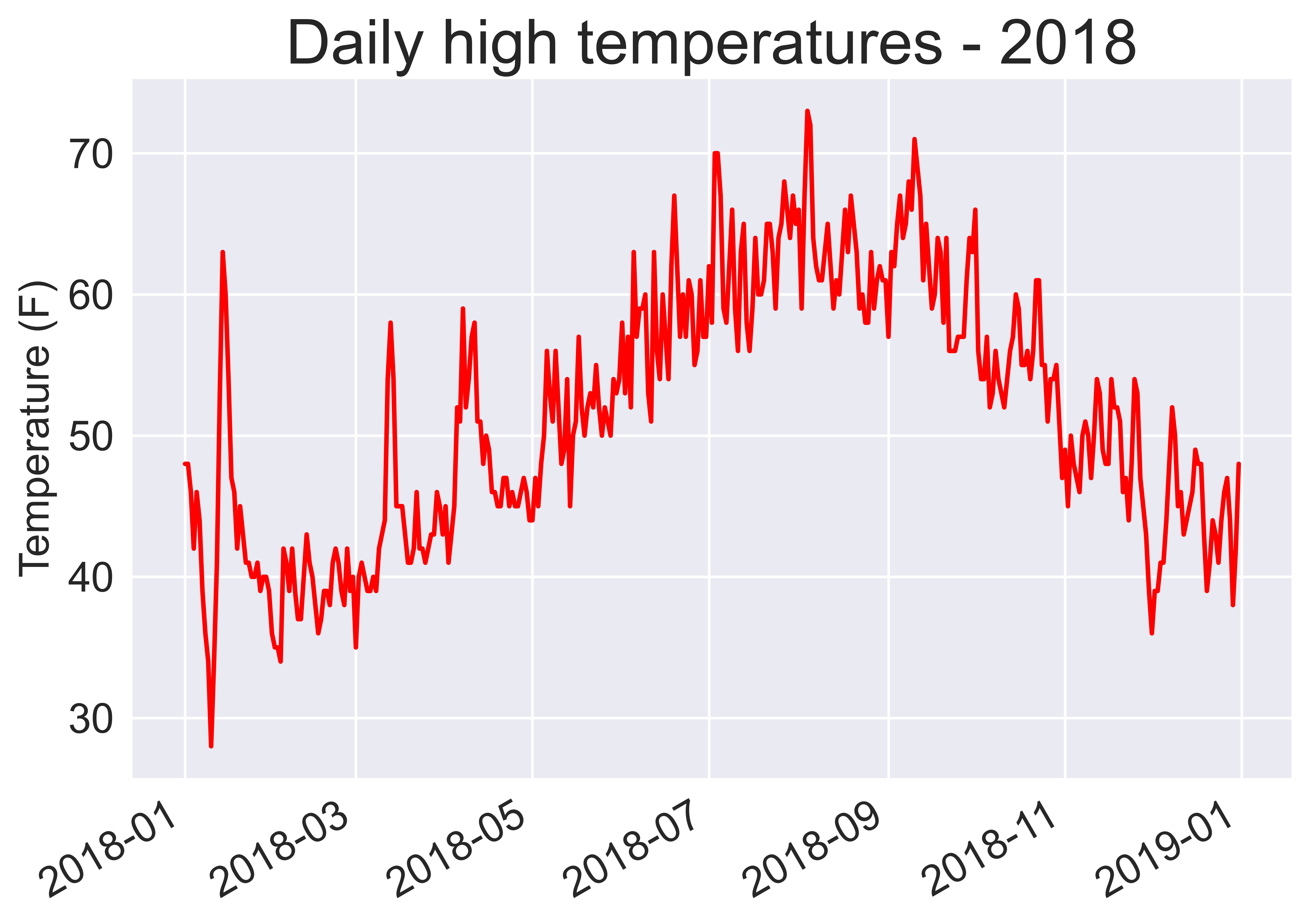
Plot a longer timeframe
1
2
3
4
5
6
7
8
9
10
11
12
13
14
15
16
17
18
19
20
21
22
23
24
25
26
27
28
29
30
31
32
33
34
import csv
from datetime import datetime
import matplotlib.pyplot as plt

filename = 'data/sitka_weather_2018_simple.csv'

with open(filename) as f:
    reader = csv.reader(f)
    header_row = next(reader)

    # Get dates and high temperatures from this file.
    dates, highs = [], []
    for row in reader:
        current_date = datetime.strptime(row[2], '%Y-%m-%d')
        high = int(row[5])
        dates.append(current_date)
        highs.append(high)

# Plot the high temperatures.
plt.style.use('seaborn-v0_8')
fig, ax = plt.subplots()
ax.plot(dates, highs, c='red')

# Format plot.
plt.title("Daily high temperatures - 2018", fontsize=24)
plt.xlabel('', fontsize=16)
fig.autofmt_xdate()
plt.ylabel("Temperature (F)", fontsize=16)
plt.tick_params(axis='both', which='major', labelsize=16)

# Save the figure.
plt.savefig("fig.png", dpi=900, bbox_inches='tight')

plt.show()
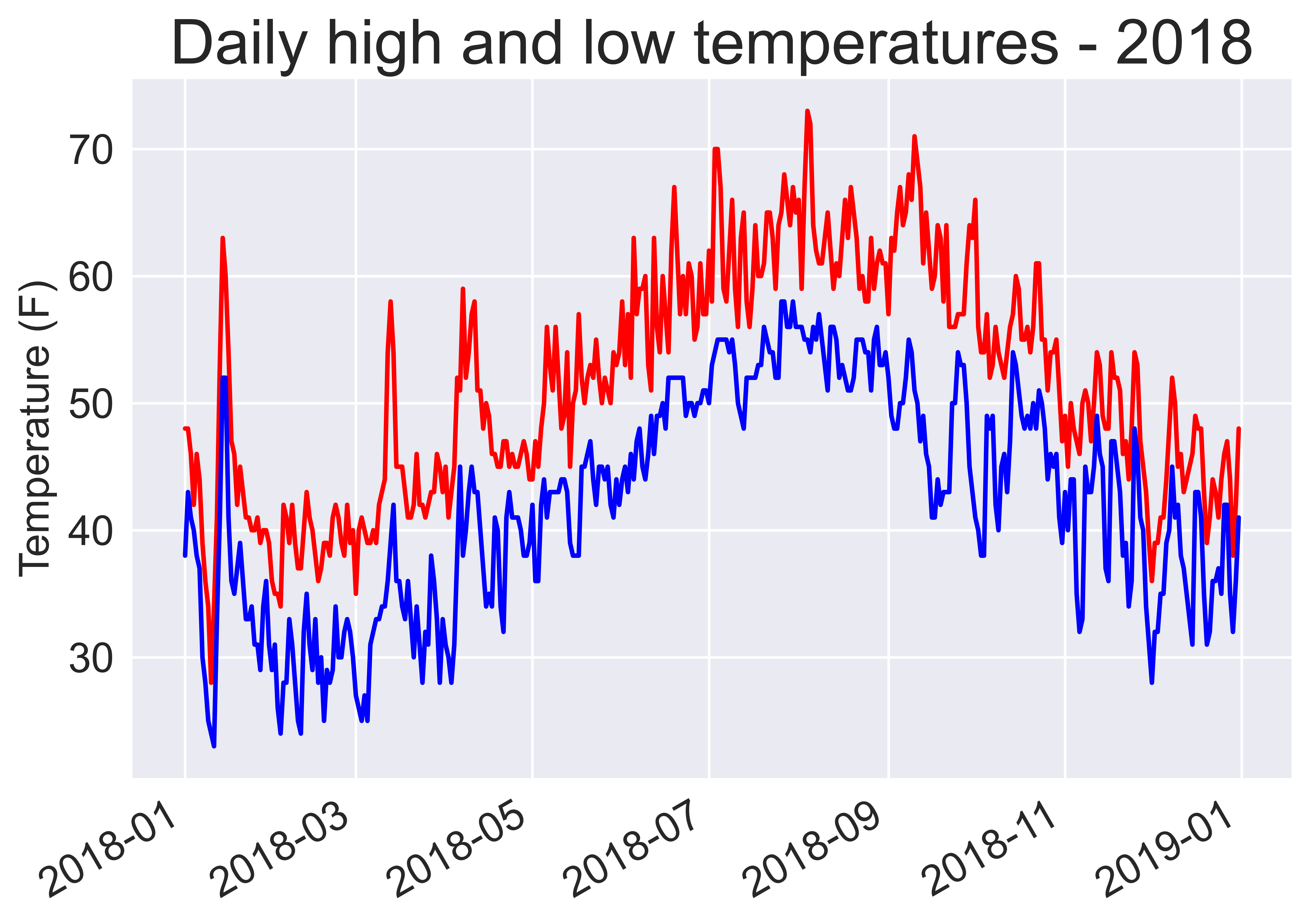
Plot a second data series
1
2
3
4
5
6
7
8
9
10
11
12
13
14
15
16
17
18
19
20
21
22
23
24
25
26
27
28
29
30
31
32
33
34
35
36
37
import csv
from datetime import datetime
import matplotlib.pyplot as plt

filename = 'data/sitka_weather_2018_simple.csv'

with open(filename) as f:
    reader = csv.reader(f)
    header_row = next(reader)

    # Get dates and high temperatures from this file.
    dates, highs, lows = [], [], []
    for row in reader:
        current_date = datetime.strptime(row[2], '%Y-%m-%d')
        high, low = int(row[5]), int(row[6])
        dates.append(current_date)
        highs.append(high)
        lows.append(low)

# Plot the high and low temperatures.
plt.style.use('seaborn-v0_8')
fig, ax = plt.subplots()
ax.plot(dates, highs, c='red')
ax.plot(dates, lows, c='blue')


# Format plot.
plt.title("Daily high and low temperatures - 2018", fontsize=24)
plt.xlabel('', fontsize=16)
fig.autofmt_xdate()
plt.ylabel("Temperature (F)", fontsize=16)
plt.tick_params(axis='both', which='major', labelsize=16)

# Save the figure.
plt.savefig("fig.png", dpi=900, bbox_inches='tight')

plt.show()
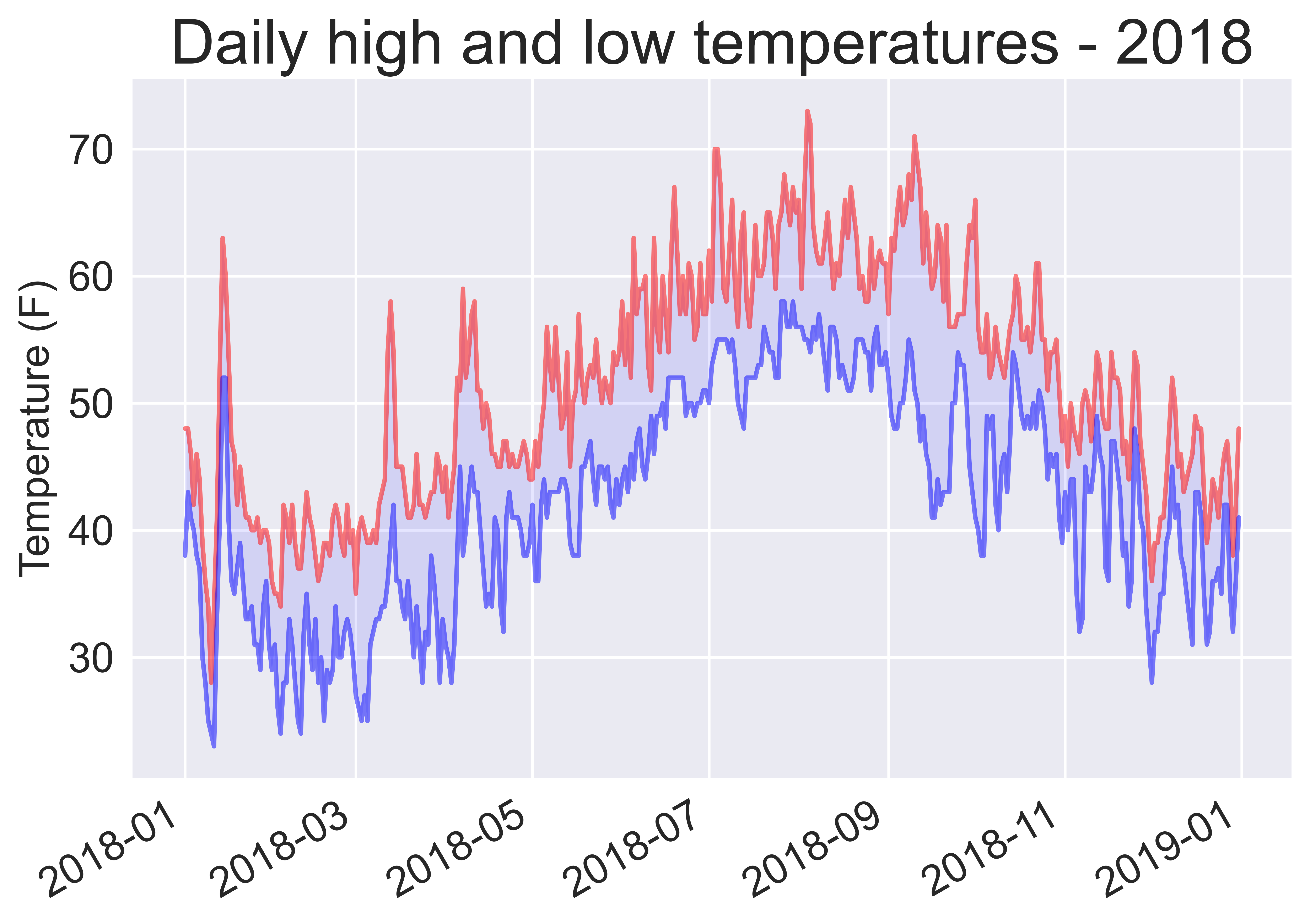
Shade an area between two data series
The fill_between() method takes a series of x-values (dates in this example) and two series of y-values (highs and lows), and fills the space between the two y-value series.
1
2
3
4
5
6
7
8
9
10
11
12
13
14
15
16
17
18
19
20
21
22
23
24
25
26
27
28
29
30
31
32
33
34
35
36
37
38
import csv
from datetime import datetime
import matplotlib.pyplot as plt

filename = 'data/sitka_weather_2018_simple.csv'

with open(filename) as f:
    reader = csv.reader(f)
    header_row = next(reader)

    # Get dates and high temperatures from this file.
    dates, highs, lows = [], [], []
    for row in reader:
        current_date = datetime.strptime(row[2], '%Y-%m-%d')
        high, low = int(row[5]), int(row[6])
        dates.append(current_date)
        highs.append(high)
        lows.append(low)

# Plot the high and low temperatures.
plt.style.use('seaborn-v0_8')
fig, ax = plt.subplots()
ax.plot(dates, highs, c='red', alpha=0.5)
ax.plot(dates, lows, c='blue', alpha=0.5)
plt.fill_between(dates, highs, lows, facecolor='blue', alpha=0.1)


# Format plot.
plt.title("Daily high and low temperatures - 2018", fontsize=24)
plt.xlabel('', fontsize=16)
fig.autofmt_xdate()
plt.ylabel("Temperature (F)", fontsize=16)
plt.tick_params(axis='both', which='major', labelsize=16)

# Save the figure.
plt.savefig("fig.png", dpi=900, bbox_inches='tight')

plt.show()
Skip over missing data
Missing data can result in exceptions that will crash the program:
1
2
3
4
5
6
7
8
9
10
11
12
13
14
15
16
17
18
19
20
21
22
23
24
25
26
27
28
29
30
31
32
33
34
35
import csv

filename = 'data/death_valley_2018_simple.csv'
with open(filename) as f:
    reader = csv.reader(f)
    header_row = next(reader)

    # Get dates and high temperatures from this file.
    dates, highs, lows = [], [], []
    for row in reader:
        current_date = datetime.strptime(row[2], '%Y-%m-%d')
        high, low = int(row[4]), int(row[5])
        dates.append(current_date)
        highs.append(high)
        lows.append(low)


# Plot the high and low temperatures.
plt.style.use('seaborn-v0_8')
fig, ax = plt.subplots()
ax.plot(dates, highs, c='red', alpha=0.5)
ax.plot(dates, lows, c='blue', alpha=0.5)
plt.fill_between(dates, highs, lows, facecolor='blue', alpha=0.1)

# Format plot.
plt.title("Daily high and low temperatures - 2018", fontsize=24)
plt.xlabel('', fontsize=16)
fig.autofmt_xdate()
plt.ylabel("Temperature (F)", fontsize=16)
plt.tick_params(axis='both', which='major', labelsize=16)

# Save the figure.
plt.savefig("fig.png", dpi=900, bbox_inches='tight')

plt.show()
1
2
3
4
5
6
7
8
9
10
11
12
13
---------------------------------------------------------------------------

ValueError                                Traceback (most recent call last)

Cell In[32], line 12
     10 for row in reader:
     11     current_date = datetime.strptime(row[2], '%Y-%m-%d')
---> 12     high, low = int(row[4]), int(row[5])
     13     dates.append(current_date)
     14     highs.append(high)


ValueError: invalid literal for int() with base 10: ''
We can choose to simply skip over the missing data by a try-except-else block:
1
2
3
4
5
6
7
8
9
10
11
12
13
14
15
16
17
18
19
20
21
22
23
24
25
26
27
28
29
30
31
32
33
34
35
36
37
38
39
40
import csv

filename = 'data/death_valley_2018_simple.csv'
with open(filename) as f:
    reader = csv.reader(f)
    header_row = next(reader)

    # Get dates and high temperatures from this file.
    dates, highs, lows = [], [], []
    for row in reader:
        current_date = datetime.strptime(row[2], '%Y-%m-%d')
        try:
            high, low = int(row[4]), int(row[5])
        except ValueError:
            print(f"Missing data for {current_date}")
        else:
            dates.append(current_date)
            highs.append(high)
            lows.append(low)


# Plot the high and low temperatures.
plt.style.use('seaborn-v0_8')
fig, ax = plt.subplots()
ax.plot(dates, highs, c='red', alpha=0.5)
ax.plot(dates, lows, c='blue', alpha=0.5)
plt.fill_between(dates, highs, lows, facecolor='blue', alpha=0.1)

# Format plot.
title = "Daily high and low temperatures - 2018\nDeath Valley, CA"
plt.title(title, fontsize=20)
plt.xlabel('', fontsize=16)
fig.autofmt_xdate()
plt.ylabel("Temperature (F)", fontsize=16)
plt.tick_params(axis='both', which='major', labelsize=16)

# Save the figure.
plt.savefig("fig.png", dpi=900, bbox_inches='tight')

plt.show()
1
Missing data for 2018-02-18 00:00:00
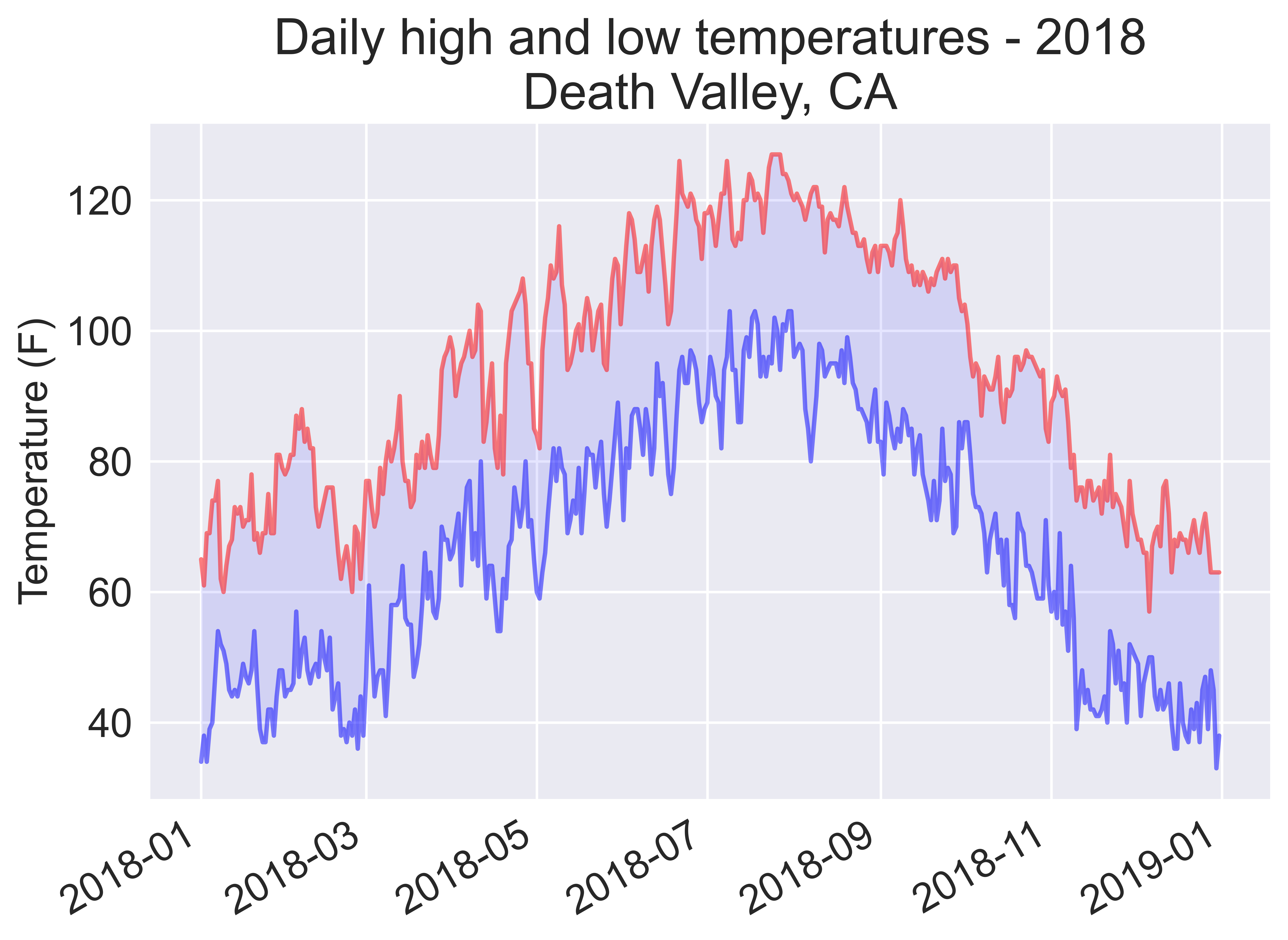
We can check for the above missing item in the file:
1
2
3
"USC00042319","DEATH VALLEY, CA US","2018-02-17","0.00","76","42","55"
"USC00042319","DEATH VALLEY, CA US","2018-02-18","0.00","","",""
"USC00042319","DEATH VALLEY, CA US","2018-02-19","0.00","66","46","46"
References