CSS Buttons: CSS Button Classes in Jekyll Theme Minimal Mistakes and Bootstrap Framework (including one way of installing Bootstrap to Jekyll website)
CSS button classes in Jekyll theme “minimal-mistakes”
Jekyll theme “minimal-mistakes” defines a sets of button styles in file ..\_sass\_buttons.scss1:
1
2
3
4
5
6
7
8
9
10
11
12
13
14
15
16
17
18
19
20
21
22
23
24
25
26
27
28
29
30
31
32
33
34
35
36
37
38
39
40
41
42
43
44
45
46
47
48
49
50
51
52
53
54
55
56
57
58
59
60
61
62
63
64
65
66
67
68
69
70
71
72
73
74
75
76
77
78
79
80
81
82
83
84
85
86
87
88
89
90
91
92
93
94
95
96
97
/* ==========================================================================
   BUTTONS
   ========================================================================== */

/*
   Default button
   ========================================================================== */

.btn {
  /* default */
  display: inline-block;
  margin-bottom: 0.25em;
  padding: 0.5em 1em;
  font-family: $sans-serif;
  font-size: $type-size-6;
  font-weight: bold;
  text-align: center;
  text-decoration: none;
  border-width: 0;
  border-radius: $border-radius;
  cursor: pointer;

  .icon {
    margin-right: 0.5em;
  }

  .icon + .hidden {
    margin-left: -0.5em; /* override for hidden text*/
  }

  /* button colors */
  $buttoncolors:
  (primary, $primary-color),
  (inverse, #fff),
  (light-outline, transparent),
  (success, $success-color),
  (warning, $warning-color),
  (danger, $danger-color),
  (info, $info-color),
  (facebook, $facebook-color),
  (twitter, $twitter-color),
  (linkedin, $linkedin-color);

  @each $buttoncolor, $color in $buttoncolors {
    &--#{$buttoncolor} {
      @include yiq-contrasted($color);
      @if ($buttoncolor == inverse) {
        border: 1px solid $border-color;
      }
      @if ($buttoncolor == light-outline) {
        border: 1px solid #fff;
      }

      &:visited {
        @include yiq-contrasted($color);
      }

      &:hover {
        @include yiq-contrasted(mix(#000, $color, 20%));
      }
    }
  }

  /* fills width of parent container */
  &--block {
    display: block;
    width: 100%;

    + .btn--block {
      margin-top: 0.25em;
    }
  }

  /* disabled */
  &--disabled {
    pointer-events: none;
    cursor: not-allowed;
    filter: alpha(opacity=65);
    box-shadow: none;
    opacity: 0.65;
  }

  /* extra large button */
  &--x-large {
    font-size: $type-size-4;
  }

  /* large button */
  &--large {
    font-size: $type-size-5;
  }

  /* small button */
  &--small {
    font-size: $type-size-7;
  }
}
It defines 11 button styles and 4 sizes, and we can use them by the following syntax2.
Buttons with different styles
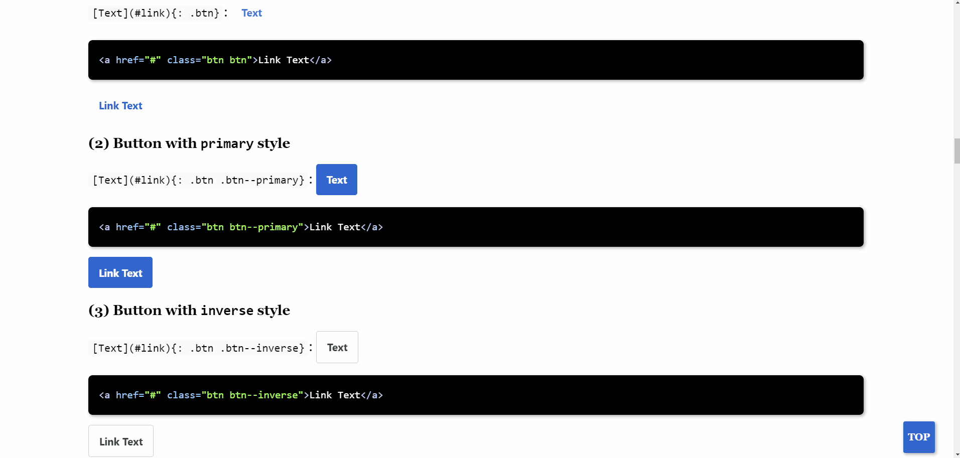
(1) Basic button
[Text](#link){: .btn}: Text
1
<a href="#" class="btn btn">Link Text</a>
(2) Button with primary style
[Text](#link){: .btn .btn--primary}: Text
1
<a href="#" class="btn btn--primary">Link Text</a>
(3) Button with inverse style
[Text](#link){: .btn .btn--inverse}: Text
1
<a href="#" class="btn btn--inverse">Link Text</a>
(4) Button with light-outline style
[Text](#link){: .btn .btn--light-outline}: Text
1
<a href="#" class="btn btn--inverse">Link Text</a>
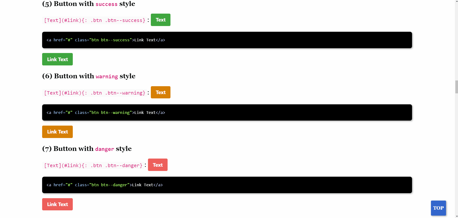
(5) Button with success style
[Text](#link){: .btn .btn--success}: Text
1
<a href="#" class="btn btn--success">Link Text</a>
(6) Button with warning style
[Text](#link){: .btn .btn--warning}: Text
1
<a href="#" class="btn btn--warning">Link Text</a>
(7) Button with danger style
[Text](#link){: .btn .btn--danger}: Text
1
<a href="#" class="btn btn--danger">Link Text</a>
(8) Button with info style
[Text](#link){: .btn .btn--info}: Text
1
<a href="#" class="btn btn--info">Link Text</a>
(9) Button with facebook style
[Text](#link){: .btn .btn--facebook}: Text
1
<a href="#" class="btn btn--facebook">Link Text</a>
(10) Button with twitter style
[Text](#link){: .btn .btn--twitter}: Text
1
<a href="#" class="btn btn--twitter">Link Text</a>
(11) Button with linkedin style
[Text](#link){: .btn .btn--linkedin}: Text
1
<a href="#" class="btn btn--linkedin">Link Text</a>
Buttons with different sizes
(1) Original size
[Text](#link){: .btn .btn--primary}: Text
1
<a href="#" class="btn btn--primary">Link Text</a>
(2) small size
[Text](#link){: .btn .btn--primary .btn--small}: Text
1
<a href="#" class="btn btn--primary btn--small">Link Text</a>
(3) large size
[Text](#link){: .btn .btn--primary .btn--large}: Text
1
<a href="#" class="btn btn--primary btn--large">Link Text</a>
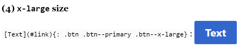
(4) x-large size
[Text](#link){: .btn .btn--primary .btn--x-large}: Text
1
<a href="#" class="btn btn--primary btn--x-large">Link Text</a>
CSS buttons classes from Bootstrap framework
Bootstrap345, a CSS framework, also provides some button classes, which can be found in the Bootstrap documentation6 (Bootstrap button: Use Bootstrap’s custom button styles for actions in forms, dialogs, and more with support for multiple sizes, states, and more). Different from above ones, CSS buttons defined in Bootstrap are realized by HTML button tag, for example:
1
2
3
4
5
6
7
8
9
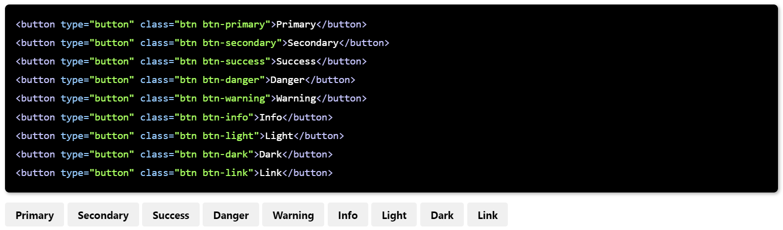
<button type="button" class="btn btn-primary">Primary</button>
<button type="button" class="btn btn-secondary">Secondary</button>
<button type="button" class="btn btn-success">Success</button>
<button type="button" class="btn btn-danger">Danger</button>
<button type="button" class="btn btn-warning">Warning</button>
<button type="button" class="btn btn-info">Info</button>
<button type="button" class="btn btn-light">Light</button>
<button type="button" class="btn btn-dark">Dark</button>
<button type="button" class="btn btn-link">Link</button>
Those button classes are defined by Bootstrap framework, and if this framework is not available in the Jekyll website, the buttons showing in the webpage are with no colors:
Medium user Robin Klöckner’s blog7 provides two ways to add Bootstrap to Jekyll website. The first method is to fetch Bootstrap from a CDN (Content Delivery Network), and the second one is to add Bootstrap bundles to Jekyll website folder. I choose the latter. And, in the following text, I would record my actual installation process step by step.
Add Bootstrap framework bundles to Jekyll website
We can add Bootstrap bundles in Jekyll website by the following steps:
Step 1: Download compiled Bootstrap CSS and JS files from the website8, we can get an bootstrap-5.1.3-dist.zip file.
Step 2: Unzip bootstrap-5.1.3-dist.zip file, there are two folders in it, i.e. css and js.
A full list of file names of files in css and js folder can be found in the Appendix.
Step 3: Rename folder css as boostrap-css, and js as boostrap-js.
Step 4: Move boostrap-css into Jekyll website folder ..\assets\css, and boostrap-js into ..\assets\js.
Step 5: Register Bootstrap in ..\assets\css\main.scss file:
1
2
3
4
5
6
7
8
---
# Only the main Sass file needs front matter (the dashes are enough)
---

@charset "utf-8";
@import "/assets/css/bootstrap-css/bootstrap.min.css"; // Bootstrap frame
@import "minimal-mistakes/skins/myskin"; // skin
@import "minimal-mistakes"; // main partials
Step 6: Add <script src="/assets/js/bootstrap-js/bootstrap.min.js"></script> at the beginning of ..\_layouts\default.html file:
NOTE: It seems OK if we skip this step when deploy website locally, but it is necessary to do such if we want to make Bootstrap available in websites based on GitHub Pages.
1
2
3
4
5
6
7
8
---
---

<head>
    <script src="/assets/js/bootstrap-js/bootstrap.min.js"></script>

 	// ...
</head>
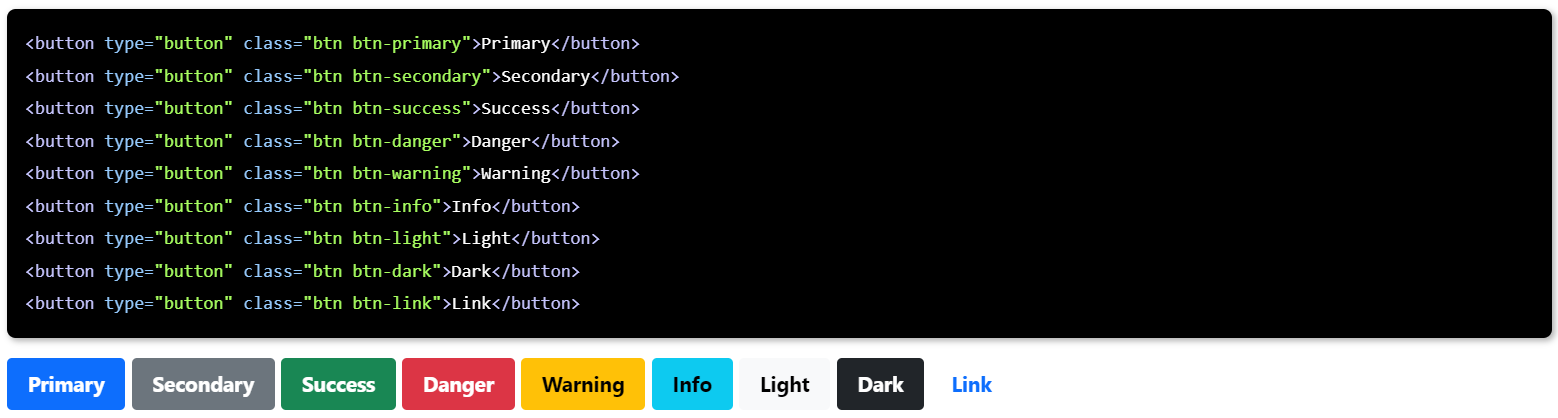
After these steps, re-deploy the website we can find these buttons display well.
Some other changes brought by Bootstrap
Actually, Bootstrap defines many components, and their definitions and functions are stored in the files of folders css and js. Aforementioned button classes are just a small part. Therefore, I found some other changes happening in my website.
The most obvious one is that color matching of inline code block has changes from
to
More contrast and … maybe cuter 😄
Another one is when I click “TOP” button, animation become non-linear from linear.
Animation with no Bootstrap framework:
Animation with Bootstrap framework available:
Other animations of jumping to a # tag on the current webpage have also changed like this.
Maybe there are more changes I didn’t find.
However for the same reason, on July 07, 2024, I delete Bootstrap framework from my website folder.
Appendix
(1) 32 files in css folder:
1
2
3
4
5
6
7
8
9
10
11
12
13
14
15
16
17
18
19
20
21
22
23
24
25
26
27
28
29
30
31
32
bootstrap-grid.css
bootstrap-grid.css.map
bootstrap-grid.min.css
bootstrap-grid.min.css.map
bootstrap-grid.rtl.css
bootstrap-grid.rtl.css.map
bootstrap-grid.rtl.min.css
bootstrap-grid.rtl.min.css.map
bootstrap-reboot.css
bootstrap-reboot.css.map
bootstrap-reboot.min.css
bootstrap-reboot.min.css.map
bootstrap-reboot.rtl.css
bootstrap-reboot.rtl.css.map
bootstrap-reboot.rtl.min.css
bootstrap-reboot.rtl.min.css.map
bootstrap-utilities.css
bootstrap-utilities.css.map
bootstrap-utilities.min.css
bootstrap-utilities.min.css.map
bootstrap-utilities.rtl.css
bootstrap-utilities.rtl.css.map
bootstrap-utilities.rtl.min.css
bootstrap-utilities.rtl.min.css.map
bootstrap.css
bootstrap.css.map
bootstrap.min.css
bootstrap.min.css.map
bootstrap.rtl.css
bootstrap.rtl.css.map
bootstrap.rtl.min.css
bootstrap.rtl.min.css.map
(2) 12 files in js folder:
1
2
3
4
5
6
7
8
9
10
11
12
bootstrap.bundle.js
bootstrap.bundle.js.map
bootstrap.bundle.min.js
bootstrap.bundle.min.js.map
bootstrap.esm.js
bootstrap.esm.js.map
bootstrap.esm.min.js
bootstrap.esm.min.js.map
bootstrap.js
bootstrap.js.map
bootstrap.min.js
bootstrap.min.js.map
References
-
minimal-mistakes/_sass/minimal-mistakes/_buttons.scss at master · mmistakes/minimal-mistakes. ˄
-
Bootstrap · The most popular HTML, CSS, and JS library in the world. ˄
-
twbs/bootstrap: The most popular HTML, CSS, and JavaScript framework for developing responsive, mobile first projects on the web.. ˄
-
How to Add Bootstrap 5.1 to Jekyll in Two Easy Ways | CodeX. ˄